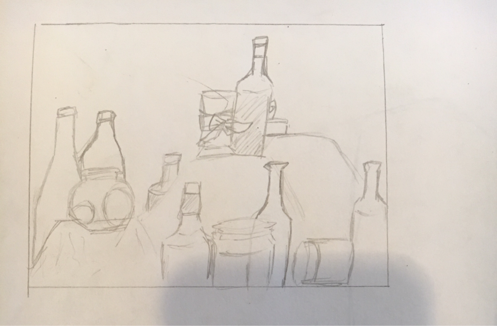
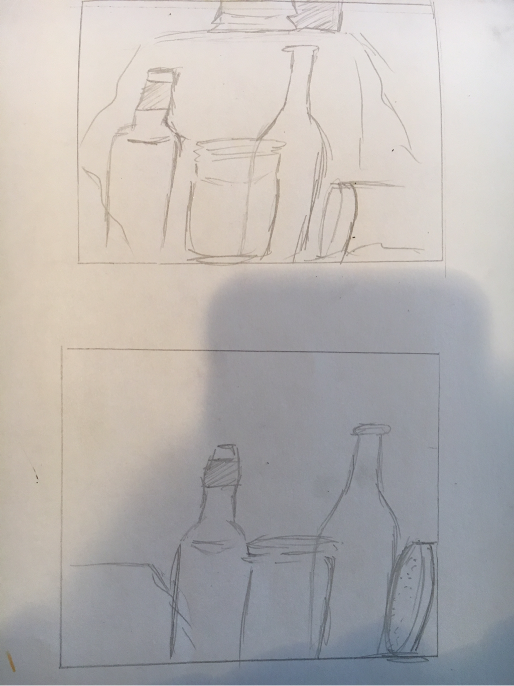
  So these are just composition sketches for ideas I have about my bottle still-life. I finally chose the second one, it's the most zoomed in and has the least amount of negative space. 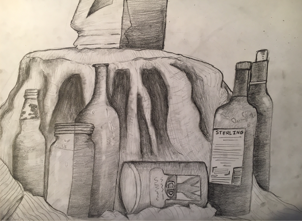 Final piece, fabric wasn't such a smooth transition. I made the composition so that I got in quite a few bottles by "zooming in" on the still life but not with so much negative space. I used only about 5 values. It would've been a smoother transition if I used all 9. Although it isn't perfectly blended, the values helped me get a sense of where a shadow lies and the contrast of light on a surface. In some of the items I would press very lightly with the pencil over an entire area and go back to where I started pressing a bit harder so that it blended. I feel like the highlights really added the affect/texture of glass or a shiny surface and that helpled visualize the bottle. I would've taken more time on it to improve the piece, used a ruler on the bottles edges, and been more consistent with my shading. 1 point perspective drawing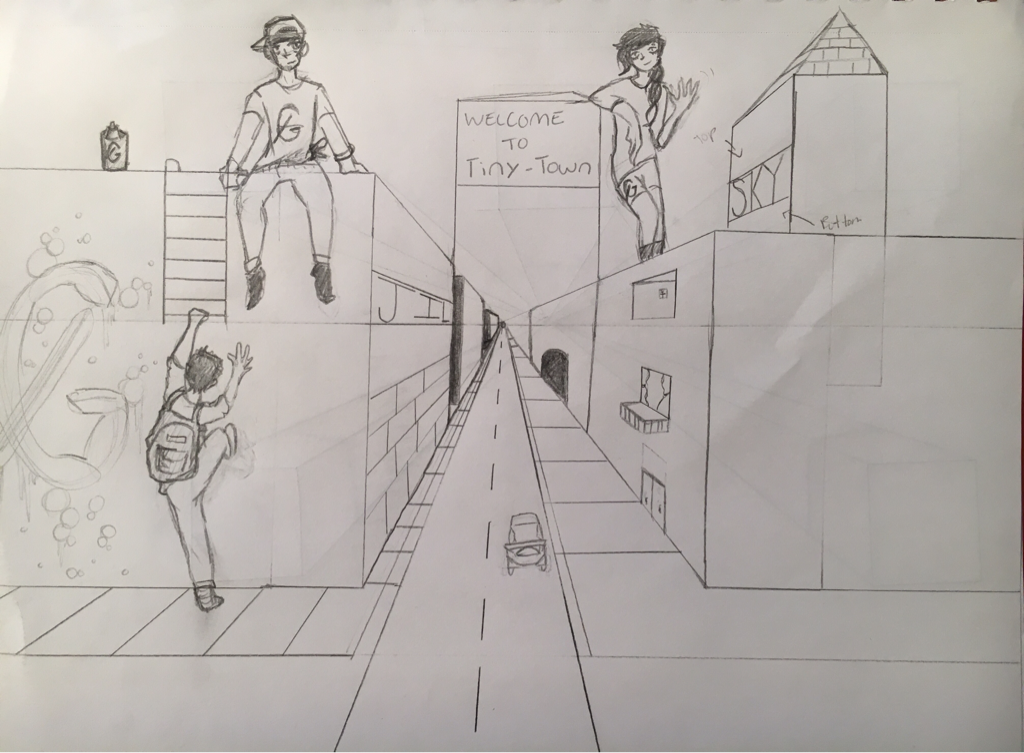 I started with a vansishinf point and drew the horizon to build off of. I drew rectangles on the sides for the buildings and angled my ruler towards the vanishing point to show distance in the buildings. Proportions weren't accurate so I made it a "Tiny Town" It's an abandoned town which is why there isn't much going on. Perfect graffiti space.
0 Comments
Leave a Reply. |
AuthorWrite something about yourself. No need to be fancy, just an overview. Archives
May 2017
Categories |
 RSS Feed
