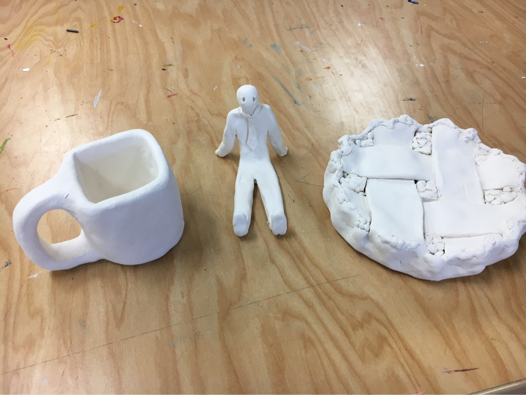
 These are my pieces out of the kiln before any glazing or acrylic paint. 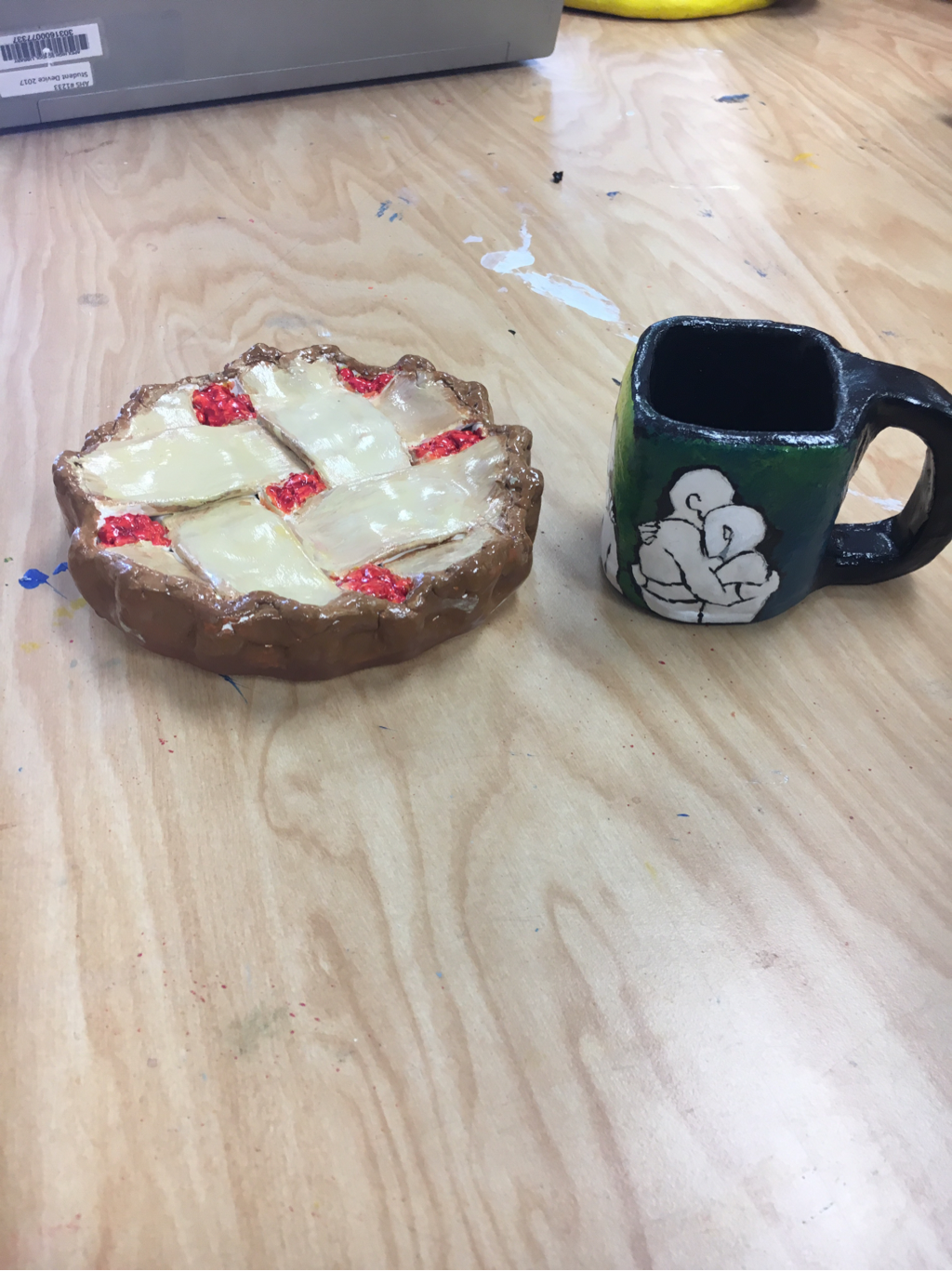 I finished painting the pie and mug and I am waiting for a small human to retreat from the kiln so I can take my final final picture. 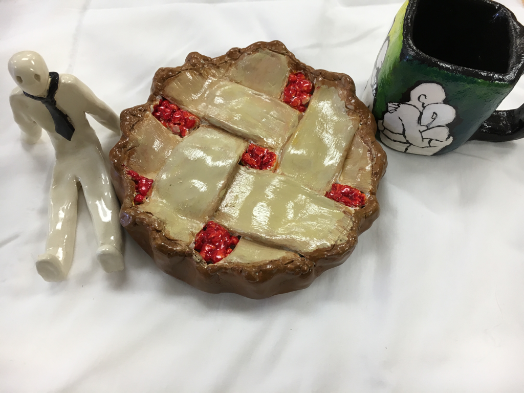 I tried my very best on the craftsmanship behind my clay sculptures. I took my time, used tools, and it looks how I wanted it to. I say it was well executed. The most difficult part of this project was making sure the clay wasn't too thick or too thin. My color choices didn't go as planned. The orange and yellow glaze for the pie filling didn't come out of the kiln in the right color. I ended up painting over with a preferred color in acrylic. The colors of the mug don't exactly harmonize with the colors of the pie. These colors were used more to direct attention to the individual pieces themselves instead of a whole composition. I believe my sculptures make you think and wonder. They are interesting because they are questionable. 3D sculpting for me is much easier when you have an idea in your head on what to make. Drawing out the volume and texture of the object accurately must be more difficult than sculpting it. I created texture in my pie sculpture by balling up small bits of clay and sticking them along the crust to create a cooked, crisp effect to the pie. If a person were to look at my sculpture they would know it's a pie. I accomplished this with picture references of latticed pies. If I were to do something differently I would have taken more time on it.. I missed a few days in class and that really affected the outcome. It could have been painted much nicer with a more clever composition. I know this wasn't the best I could do.
0 Comments
 in progress   This is my finished project, and here's a painting by Mary cassat for comparison 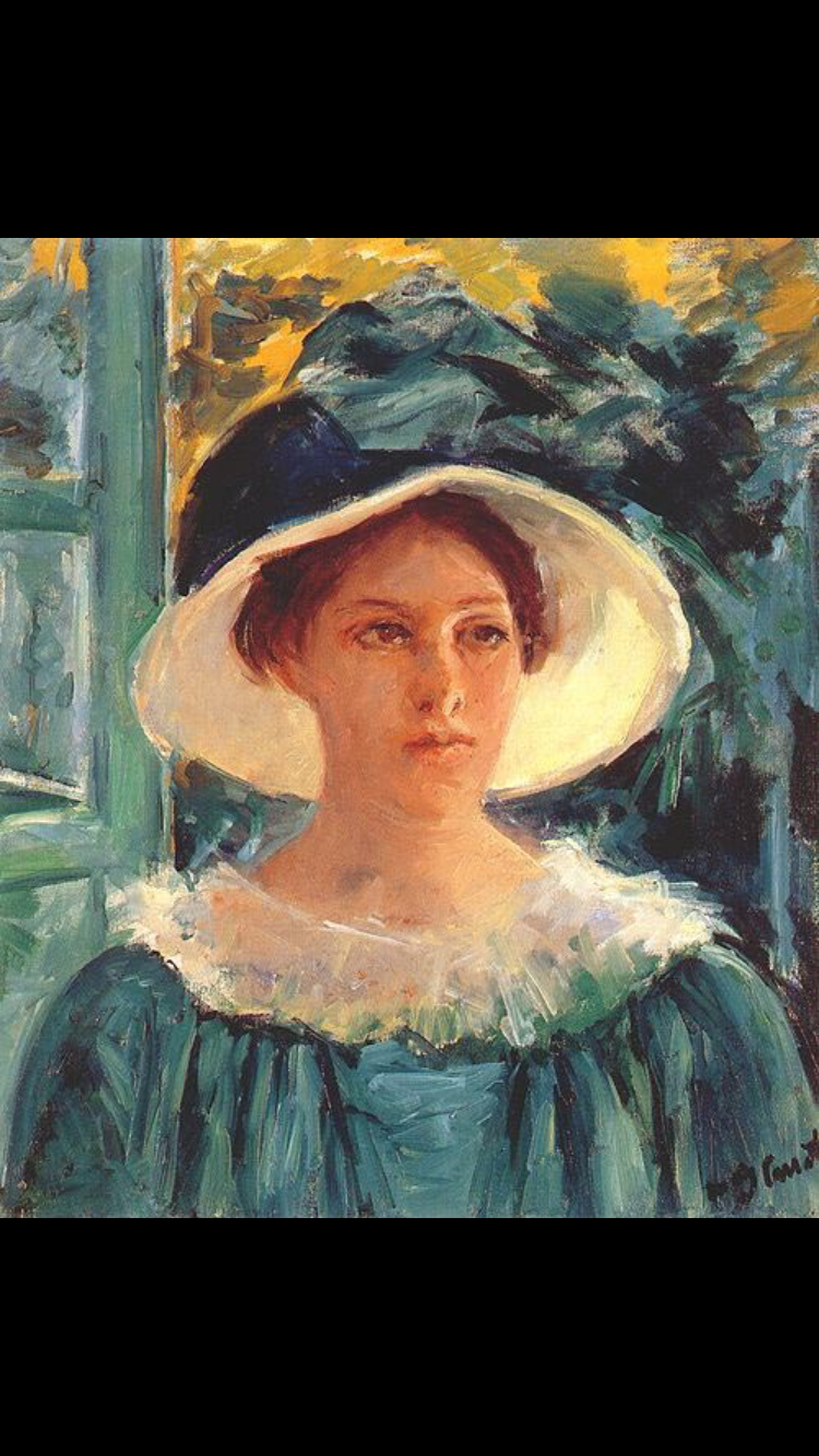 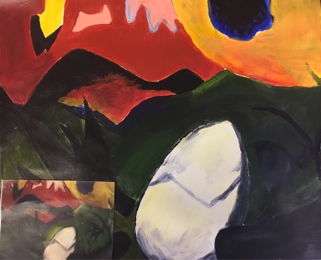 this is a recreation painting of an original artist painting. Is it sad I am most proud of the egg. I could've been more careful with shading and detail.
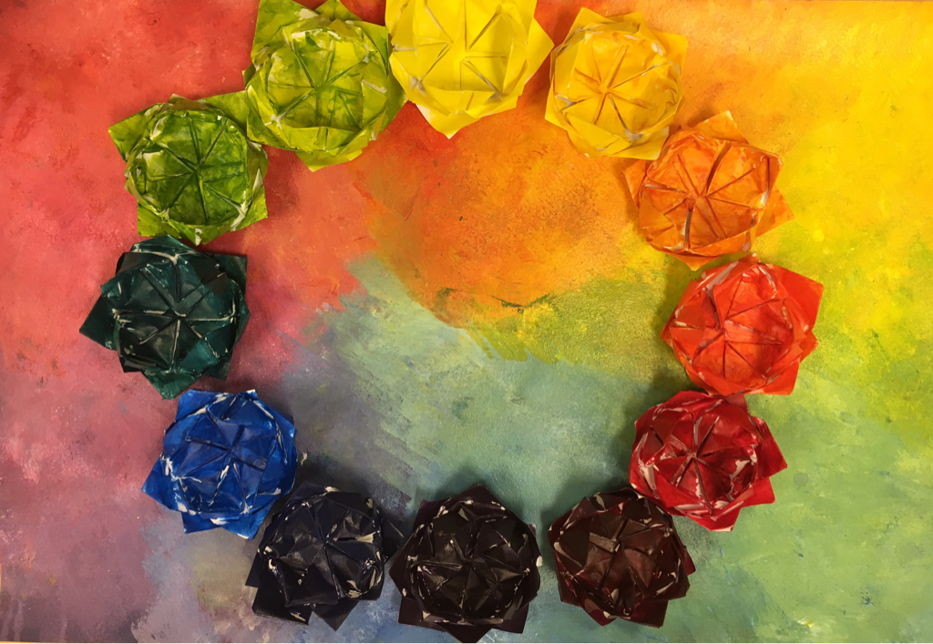 i made some origami flowers and painted them with the basic colors of the color wheel, I wanted to make the background interesting too so I took a sponge brush and dabbed on a bunch of paint. It was hard making the colors transition smoothly.
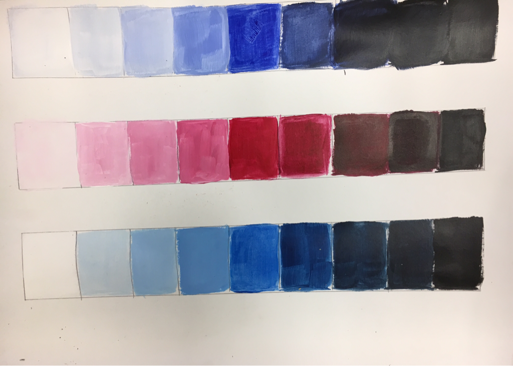 I used White at the beginning and solid black at the end, and the pure color in the middle. On the left side I slowly added the color to white paint and put it down to get the tint transition, and added black to the color on the right side to make different shades of the original color.
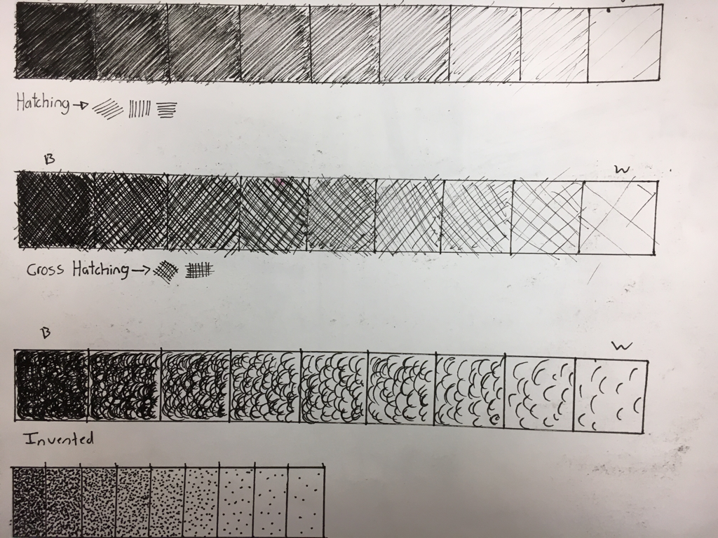 This is a pen value chart. For hatching I used finess with the flick of my wrist to get consistent results. With hatching I am using the flick of my wrist in two directions and applying lighter pressure as I get lighter in the value chart. Invented shading was my own creation, where I flicked my wrist in circular motions. The idea is to start with more layers and pressure the darker your value is and lighten up slowly as you go brighter in the chart. Same with stippling except it consists of aggressively pecking your paper with the tip of your pen until all the tiny dots come together and form a solid black square of wasted time and impatience. Are you happy Rossi.
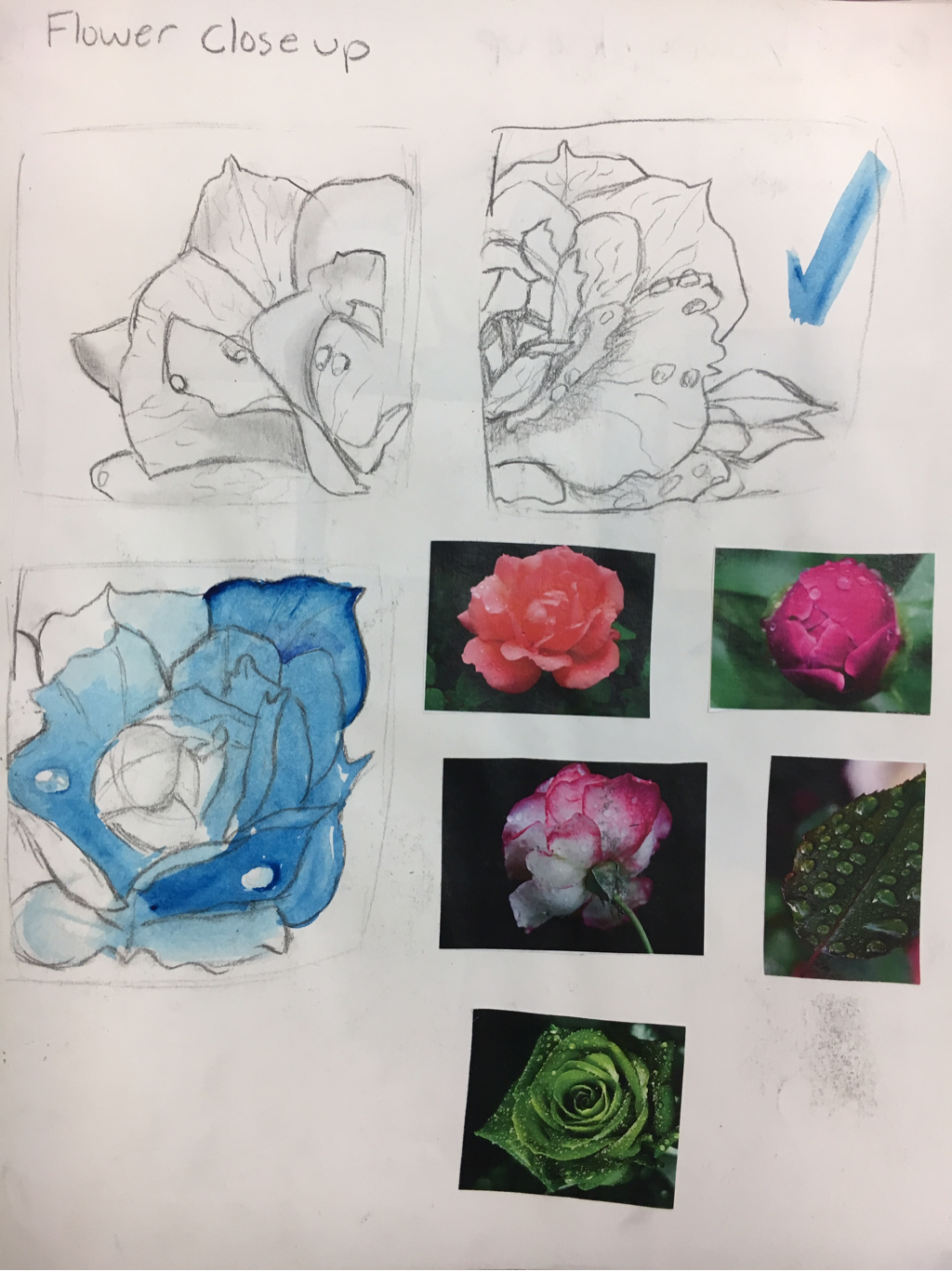 Idea for my Georgia O' Keeffe inspired close up drawing. 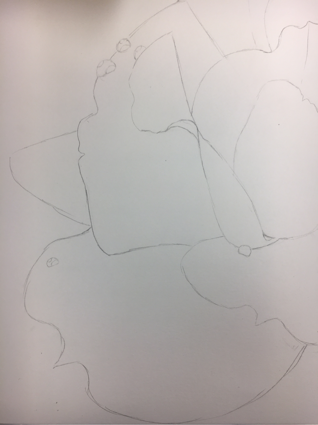 Here's an outline of a close up flower. In progress final piece, I made sure to add raindrops for more texture. 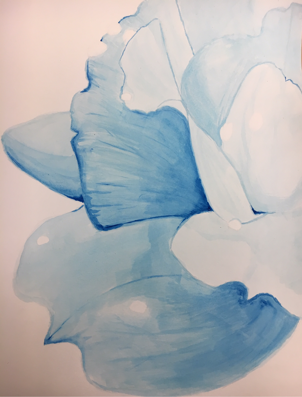 I would've originally stopped here because that's my art style. I don't usually add a lot of value and I like things looking subtle. I chose to use blue water color even though my reference picture was originally pink. It contrasts better in my opinion. 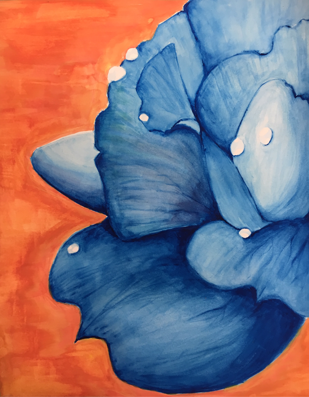 Well that escalated quickly. This is the final final piece.
I feel it's neat for my experience in watercolor. I would hope it's well crafted. I tried to add texture to the floor so it didn't look too flat. As for depth and value, I did fairly well. I know that because as I was adding layer after layer I had time to re evaluate my entire life and question my existence. I do feel I used a full range of values considering I didn't use black. I kept layering the blues. I think I represented Georgia's art in the complimentary colors and close perspective. And she likes making abstract flowy art and my piece fits that category. I used blue and orange because they're complimentary and kind of remind me of the beach. Or something summery. Stereotypically it's a more masculine look on something flowy and feminine and I like contrasting in ideas and colors. I used the raindrops as a way to show light was hitting them, and added dark shadows to where the petals overlapped one another. I also added darker colors to create texture and shadows. I had a hard time adding the texture and layering layers after layers without messing up texture. I had to re apply a lot of details, I also missed a day and had to think of ideas on the spot. I don't feel too connected to the piece and it caused me to feel a lack of motivation to finish but this project taught me something. To improve my piece I would've added more shadows and color to the flower instead of making it one solid color. I also had little to zero experience in drawing and shading water or rain drops. So I would be a bit more patient with those. 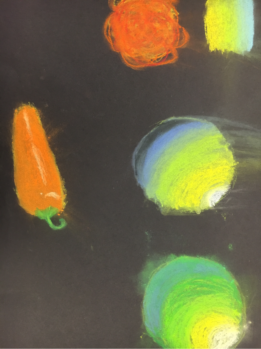 Its very easy to blend but you can over blend it. But as easily it is to blend, it's also really hard to blend because it doesn't look right when blended because you can just see the paper through it. I tried using different colors to show the change in value but it didn't blend as much as it did make a huge mess. 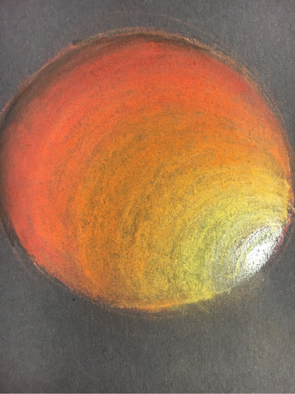 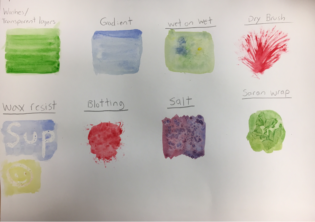 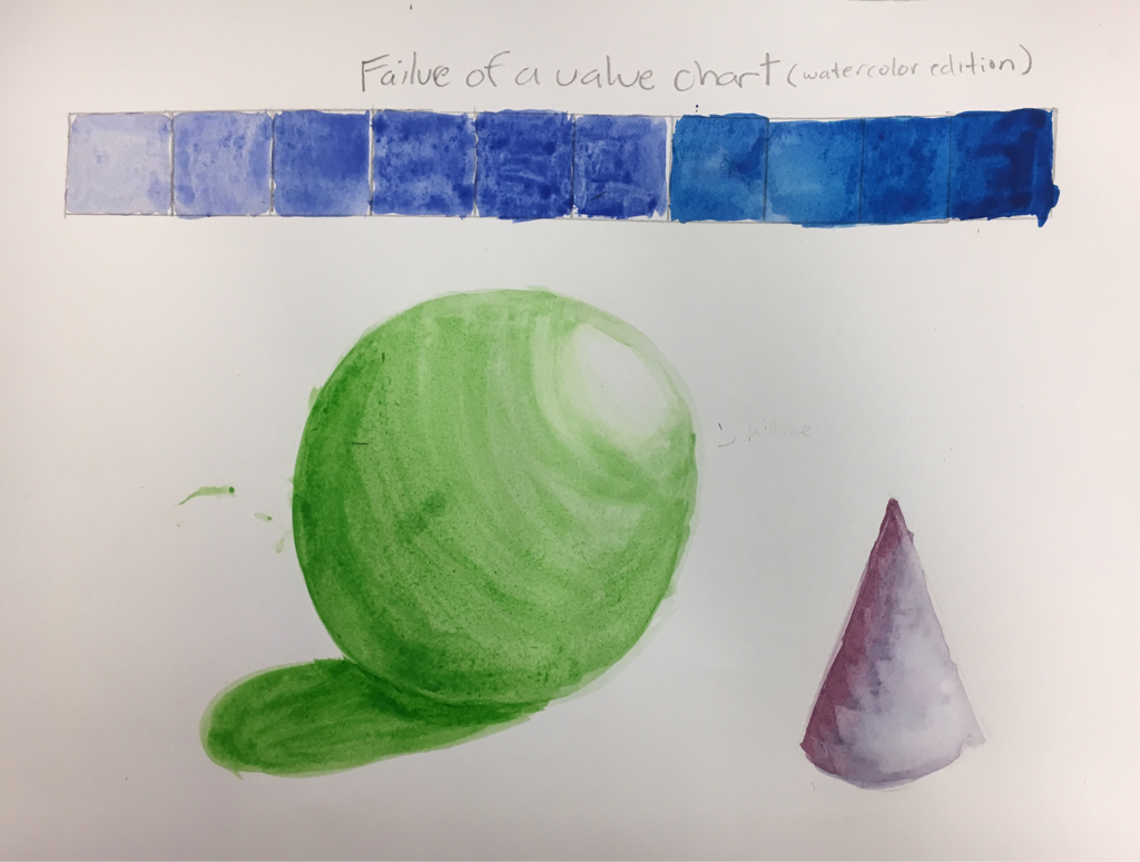 water color practice, my favorite is Seran wrap and gradient for techniques. dry brushing helps add value.
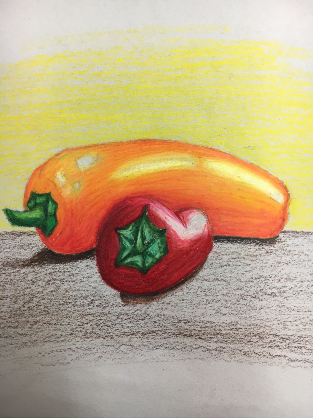 They look more realistic if you squint at it. This was my first time layering prisma pencils. I chose the two peppers so that there could be a different color chart for each one.
|
AuthorWrite something about yourself. No need to be fancy, just an overview. Archives
May 2017
Categories |
 RSS Feed
