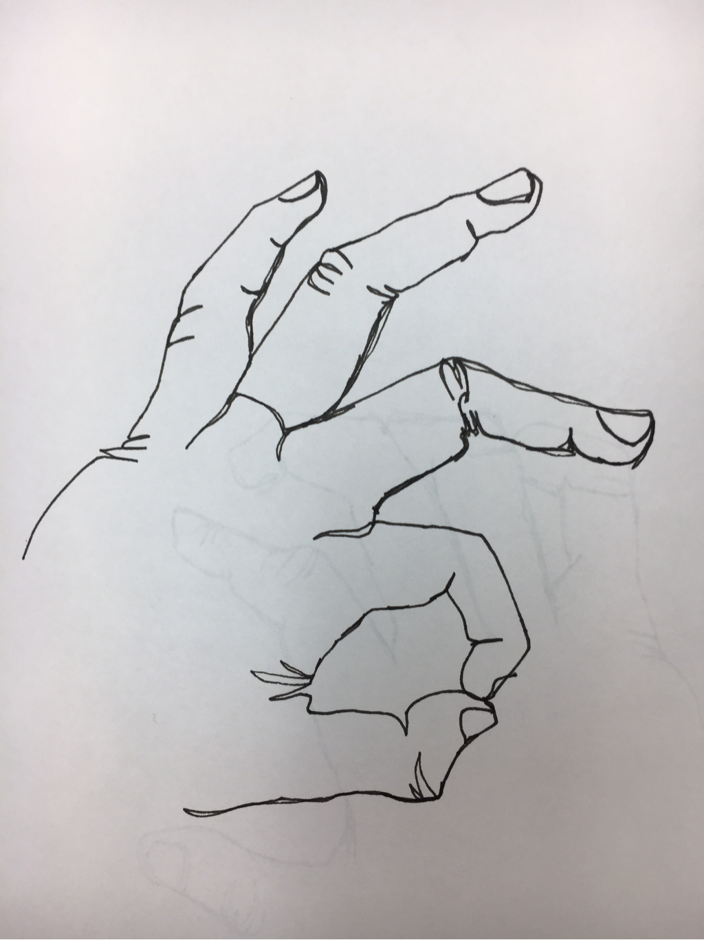
Blind Contour Hand Drawings
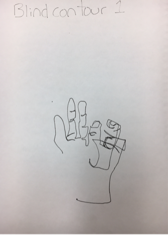
As you can see we're already off to a great start. Contour line drawings challenge you to catch the shape and perspective of the object/objects in front of you all whilst not lifting your pen from the paper, but drawing in a continuous fluid line. What we did for this project challenged us to draw without even looking at the paper. I did this for two more pieces.
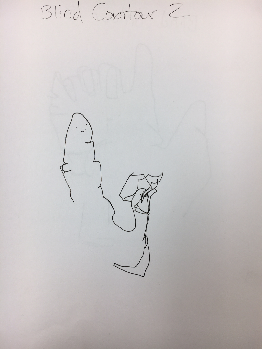
And you would think to yourself. "Maybe this one will be better as I've already practiced on the first one" you are wrong. This was also done while not looking at my hand but dragging my pen over the paper behind me while I tried to study the shape of my hand.
I swear I'm not doing this on purpose. It was challenging to remember where you left off with your pen while you were drawing, you'd lose track of where your pen was and I couldn't capture the proportions quite right. The smiley faces are there for my own comedic relief.
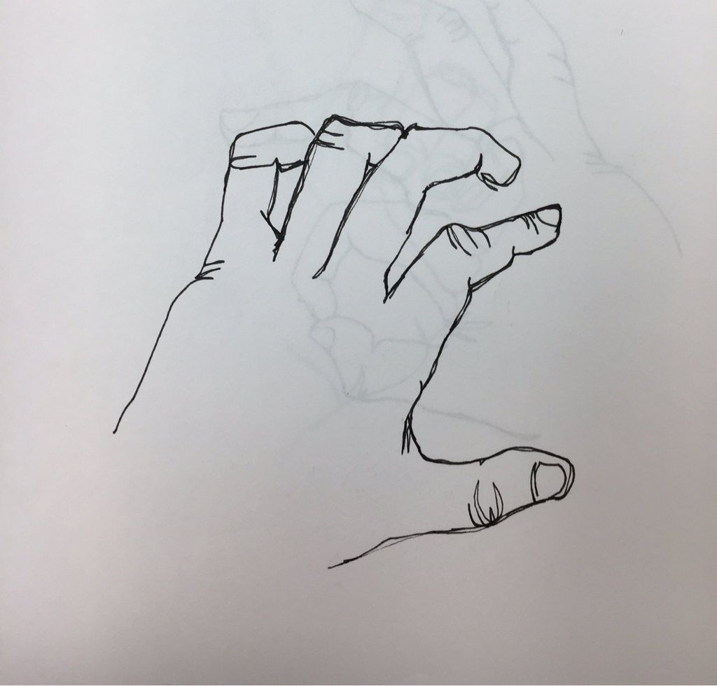
Modified
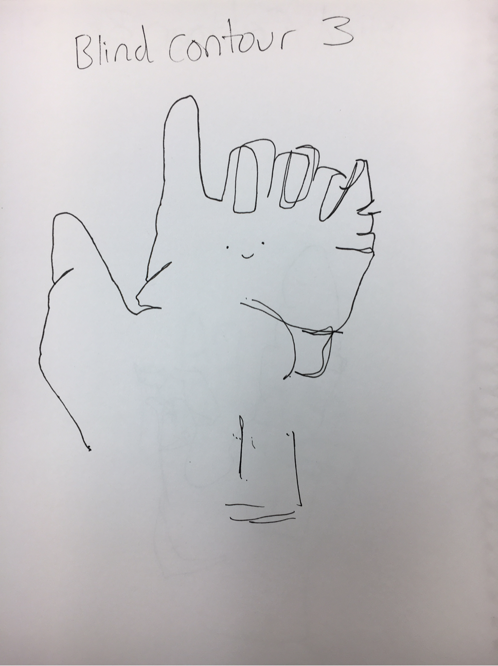
I got to look at the paper this time, it now resembles a hand. This was much easier. I thought it was absurd we were drawing blindly for our practice.
I chose this gesture because I believed it would create lines in the hand that would help me practice drawing them.
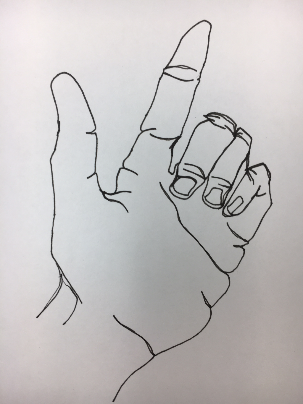
These all have a messy look to them but I think it's a fun style and I'll actually be using it more now that I've been introduced to it.
Contour Backpack
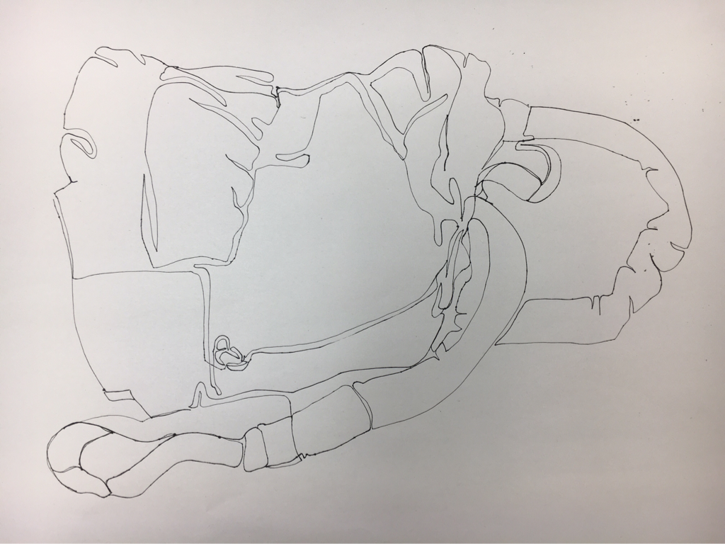
This was another contour line drawing. It was difficult to draw in the folds all while making it look like a backpack and not a lump with random line placement.
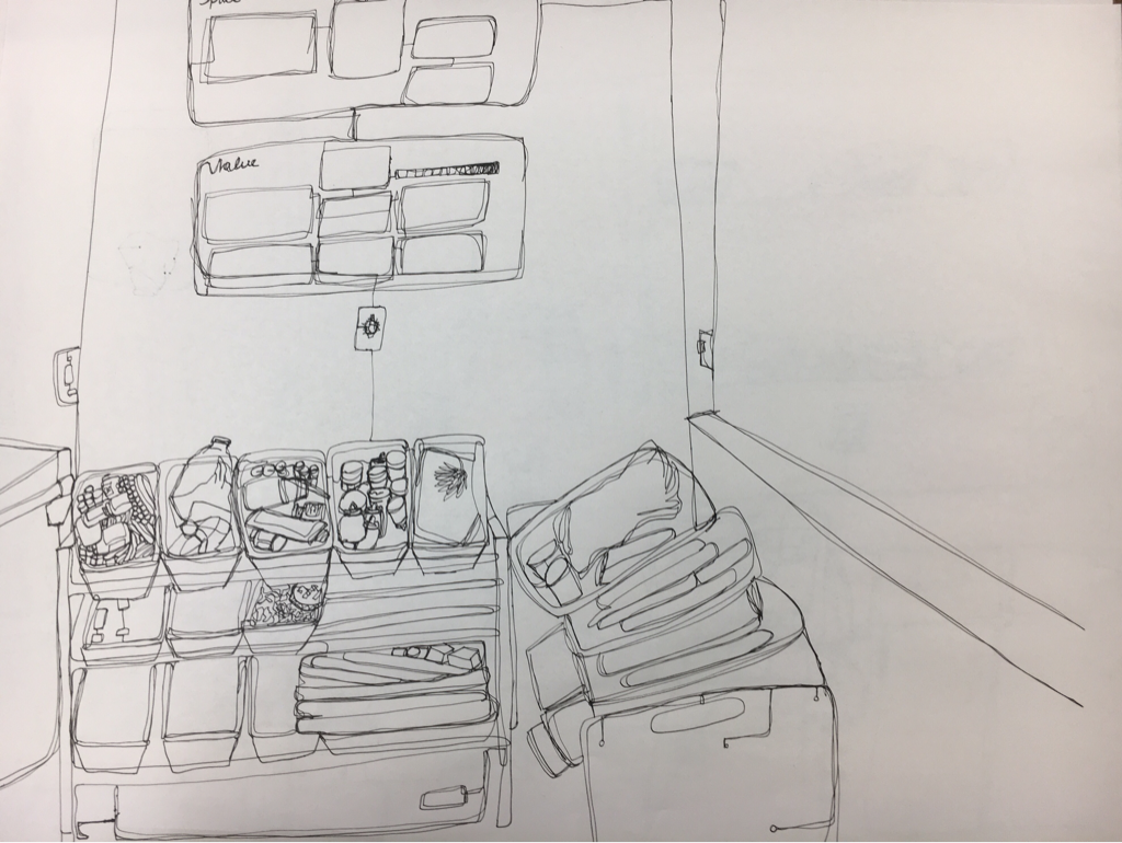
Practice Contour Room Drawing
I really. Really focused on getting every detail. My biggest problem was where the lines were gonna connect and how in the world am I gonna make that shape in perspective. I tried with proportions, took a whole class but I can do better.
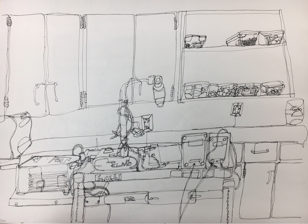
Final Contour Room Drawing
1. Did you use a fluid line? Explain how is this evident?
I used a fluid line, did not lift my pen and tried not to go over lines too much. You can the flow in some of the containers and the books where they're not easily distinguished but still resemble the object.
2. Explain how your knowledge and creating practice studies with contour line contributed to the success of your piece.
To not focus on whether it looked completely clean or neat helped me focus more on the shapes and depth of the objects rather than if they met my standards or not. I was drawing what I saw and not what I wanted to see, in some way.
3. Describe the difference in your contour line drawing to an outline drawing.
An outline drawing is more like a Silhouette while the Contour lines capture folds and creases and textures in objects. They're much more messy and detailed.
4. Explain how your interpretation of line is essential in capturing the look of the room.
The mass and perspective of the objects and room placement took a key part in taking a single line drawing and making sure it wasn't a 2D drawing and making it more full and 3D. It was especially hard doing this because usually when you want to draw a shape in 3D you sketch a starting shape and take time to think of how you'll make it, but if you hold the pen in place too long to think it bleeds.
6. What did you learn from completing this drawing? If you could recreate your piece what would you do differently to enhance the final outcome?
I learned a different level of patience. I learned a new style I enjoy. It challenged me in multiple ways. First I had to accept this wasn't going to look familiar in style. Then I had to maintain self control and keep the pen on the paper even if I messed up. I was challenged to focus. It can be very easy to become distracted from something so tedious. If I had to change something I would've included more details or really just found a place with more to draw so it doesn't look empty or incomplete.
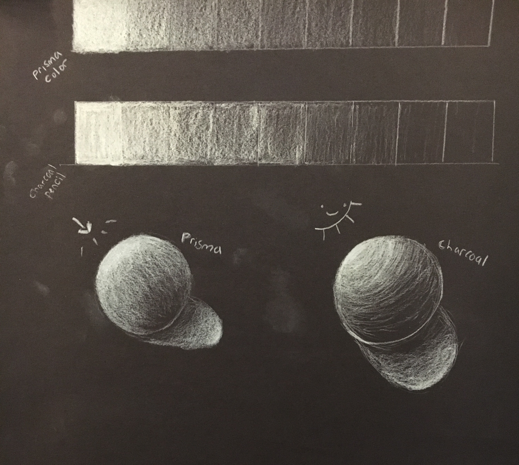
9 step value chart and adding form to shape
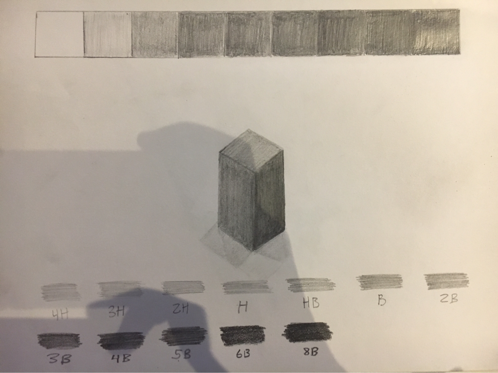
I drew a chart to fit 9 varying shades made by the same pencil. From light to dark by changing how much pressure I put on the pencil, and creating the smooth look/transition by using small circular motions to make sure it didn't look spotty. I then drew a prism that was in front of me on the table and added value to it by showing the differentiating shades.
Mini still life
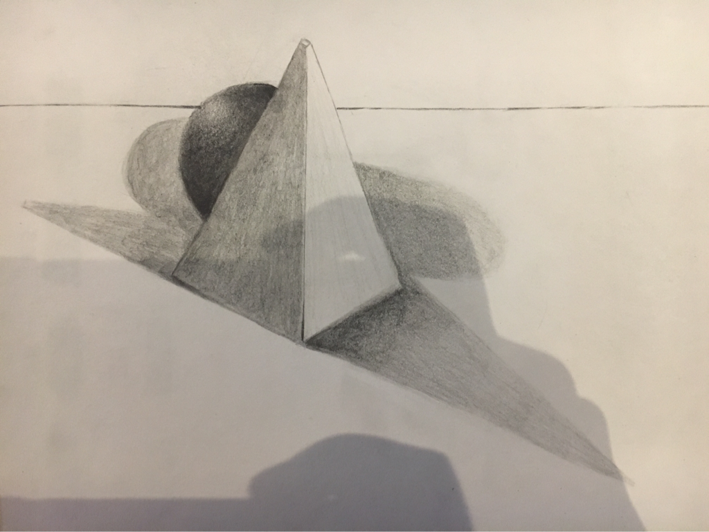
In this drawing there are varying values and shadows underneath the pyramid and sphere. I've been using the same techniques with pencil. Pressing hard in the shadowy areas and applying lighter pressure at the lighter points on the forms.
Homework 1
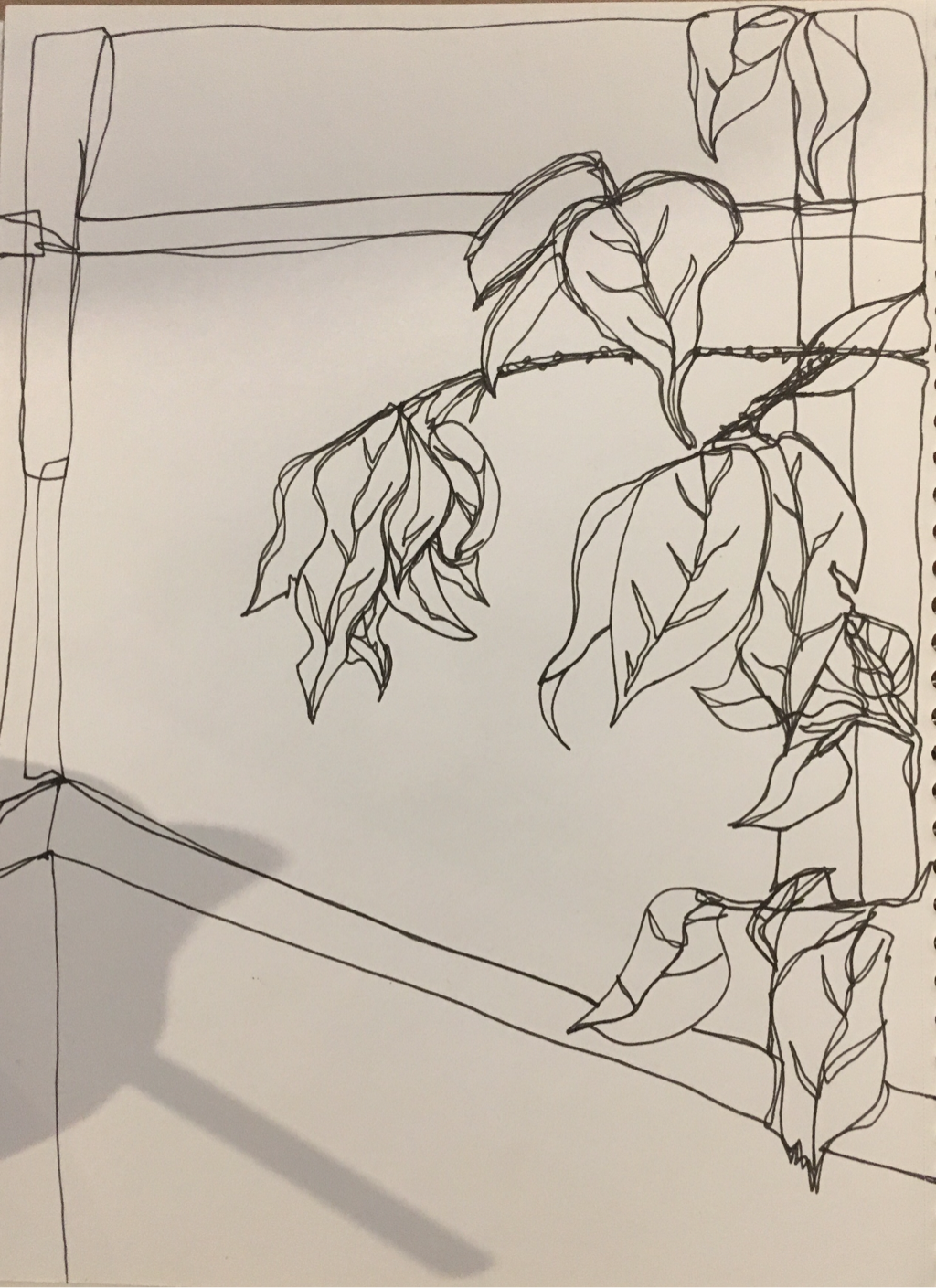
This was homework, I went to Cary Town Mall and sat in the corner at the food court and drew one of their plants as a contour line drawing. Did not lift the pen but still tried to add depth and perspective.
White ribbon
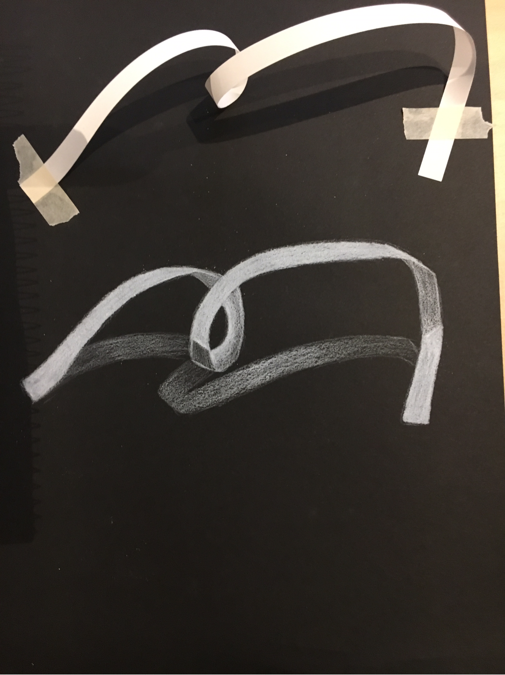
Here I drew the outline of the paper ribbon and where it overlaps and added reverse shading with the white pencil, also keeping in mind to add reverse shading to the shadow underneath the ribbon. Whiter areas represent the lighter areas and the black paper underneath thinner layers of white pencil represent the darker values.
Value in 3 medias/ fabric
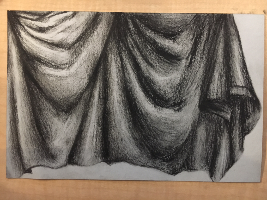
I drew the outline of the folds and the fabric, and used my values to show where it dipped and rose up and show where the light hit and the gradient from dark to light. The title is, I hate charcoal.
Did the same thing here but in reverse in prisma color on black paper. The title is, I hate prisma.
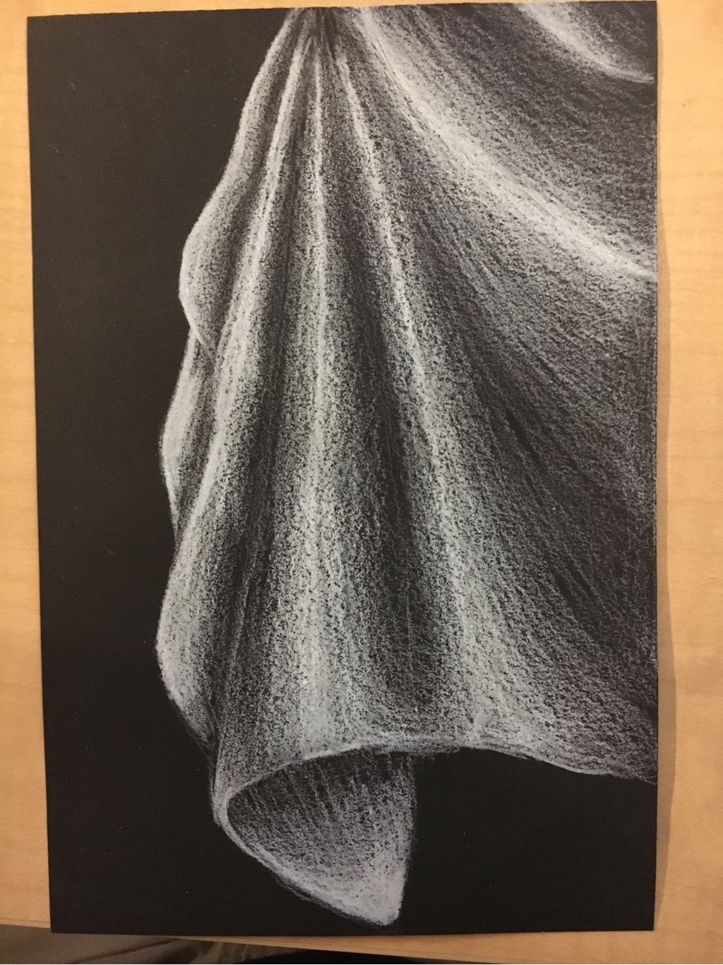
same concept here. Looks like thin flowy material. It is made of white chalk. Title is, death to my ears.
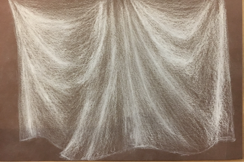
Prisma and white chalk value chart
I very much dislike the white chalk. Prisma is looking better and better by the second. I started with lights and went dark
Charcoal fabric final
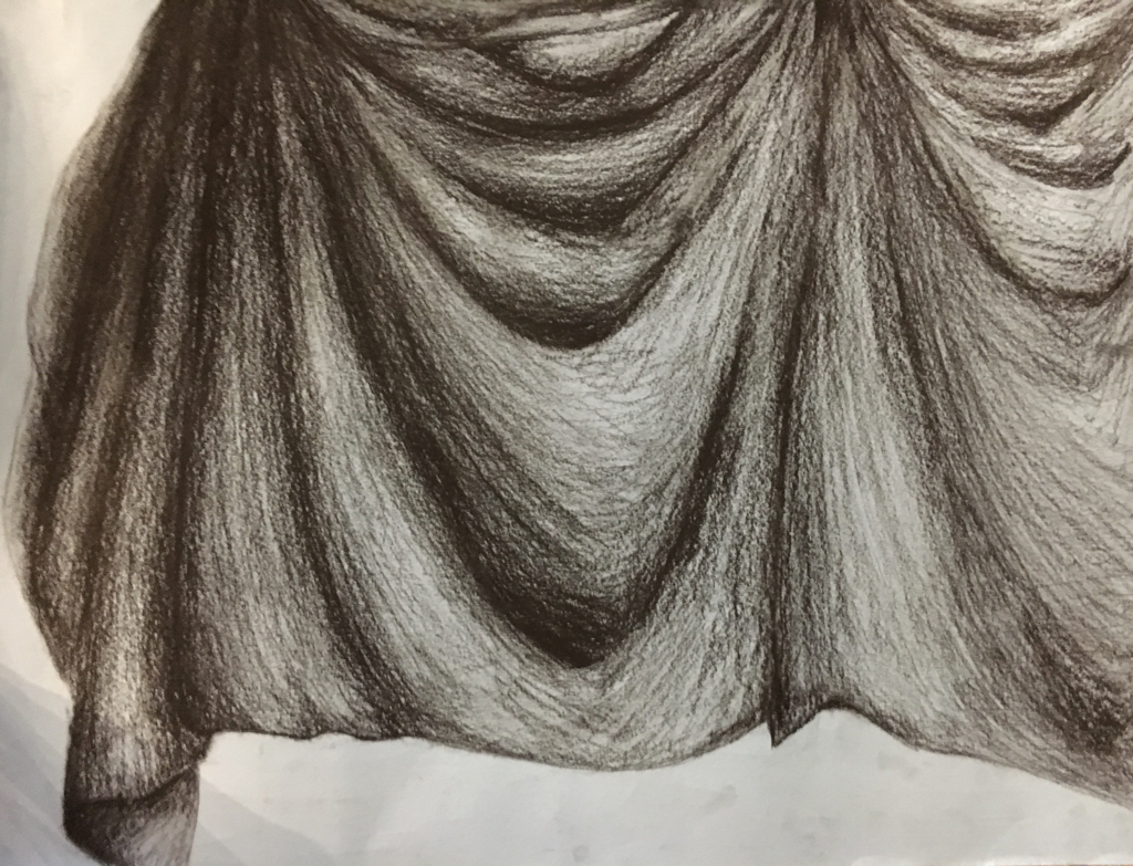
I don't have my 3 in progress pictures. This is the final of my drawing process to create a dimensional fabric and fabric texture using shapes and values.
1. Did you use a wide range of values?
Yes. I used all 9 values, This is evident because as the shading fades into the next fold in the fabric you can't tell where it begins or ends except in the deep folds where the light and dark are next to each other.
2. Explain how your knowledge and creating practice studies with value contributed to your piece.
My practices really helped get a better eye for shading and the way things are shaped and the gravity of the fabric. The inverse shading helped too. Made you think hard about where the values were and how shadows wrap around an object.
3. Describe the blending and transitions in your fabric
In the darker areas. You press hard with the pencil. As the shading gets lighter. You press down lighter. And maintain that level of pressing down in one area so it doesn't look patchy. The charcoal is soft and transfers easily onto the paper. The darks respresent. The shadows. The lights. Represent, where the lights hit. The highlights. I views the fabric as peaks and valleys. The valleys are dark and the peaks are lighter.
4. Explain how your interpretation of texture is essential in capturing the look of the object.
light bounces off of different textures differently. I could've made this fabric look as if it was made of metal if I shaded it that way. Or make it look like it was made of fur. Or thin or translucent like butterfly wings or lace. Fabric is soft and has soft transitions and absorbs the light so there's not too much dramatic shine like metal would have.
5. If you could recreate your pieces what would you do differently to enhance the final outcome?
Used the eraser to enhance highlights. Try to blend more smoothly.
Still life compositional sketches
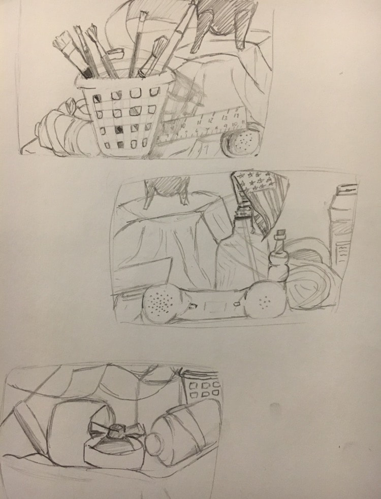
Here I went and sat around different parts of the room and drew the outline of the objects on the table to find the best composition for my final piece.
Still life, the life drawing that is still.
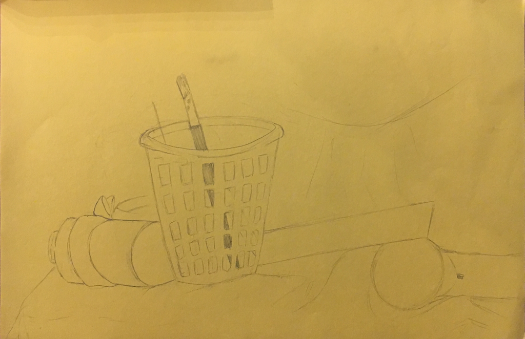
The drawing that is in progress. Here I do a simple outlines of the objects and shade later.
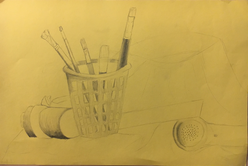
The shading is. Coming along. I'm trying to shade so that it matches the shape and texture of the object (making plastic look like plastic and metal look like metal)
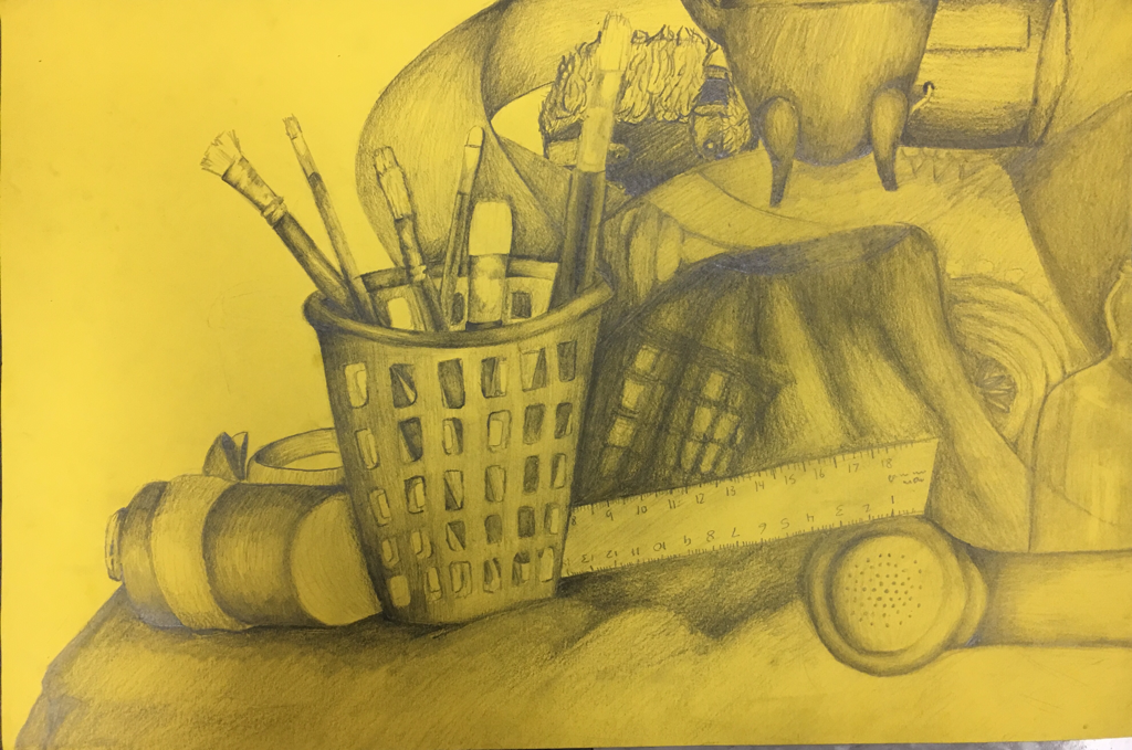
1. Describe the craftsmanship of your drawing.
I could have been more accurate with my lines, the edges are pretty clean, the blending consists of all 9 values. There's smudges here and there but it's a nice composition and I cropped the point of view well.
2. Are your values and shadows realistic? How many values did you include? How and why are values important?
My shadows are realistic, they were drawn from real life, I included all 9 values. And the values are important in giving the object shape and texture. It helps it look more 3D. The values didn't exactly match up with the values in real life, they're exaggerated.
3. Is there a clear source of lighting?
There is considering there were lights on the right and left side of these objects leaving room for darker values more in the middle.
4. How important were the compositional sketches? Explain. The compositional sketches were good in deciding how to crop the picture and fit everything in the image. It also gave you practice to outlining the objects before shading them in.
5. How is your final drawing successful?
It's a big step up from any realistic drawing I've done before. I learned a lot through the process and now I know more of what and what not to do for better improvement in the future when it comes to realistic drawings or anything that consists of value or texture.
6. Are the proportions, structure and perspective of the subject correct?
The perspective is correct but proportions are slightly off, it was hard scaling it to proportion by just looking at it.
7. Does the placement & grouping of objects create a pleasing arrangement (composition)?
Yes, It's the best arrangement I could honestly stand to look at. It was a nice variety of items with different textures and sizes to experiment with.
8. Is there a center of interest and is it well located?
I would say it's the bucket of paint brushes. It's very easy to locate. It stands out most, has the most presence in the drawing.
9. How well did you manage your time and resources throughout the process of creating this drawing? Do you see where you could improve in this area?
I could have worked more diligently and stuck my focus strictly to this drawing, putting more effort into every line and bit of shaded area. I managed to use my pencils and eraser to the best of my knowledge in creating the right transition from dark to light for certain objects. I would have taken more time on smooth shading.
10. What challenges did you encounter during this project and how did you overcome them?
The obvious one being not wanting to do it, but needing and wanting that experience in order to make it easier to overcome future projects. I had difficulty knowing where to put the light source because there wasn't only one. So I shaded to the objects shape first and then put any casting shadows.
11. What have you learned drawing a still life?
That I wanna draw people. Not teapots and telephones. And that it gives me an opportunity to strengthen my ability to portray different textures and shapes with all the different things that were on the table. I guess I'm being a bit stubborn about the not wanting to draw the objects because it's the equivalent to feeling like I'm drawing a still life of rocks. I feel the biggest challenge was drawing something that I wasn't interested in or that bored me.
Prisma pumpkin
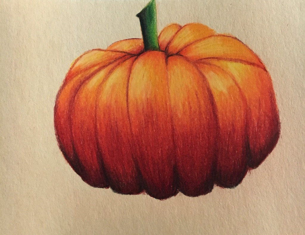
Here I took prisma colors on an outline of a pumpkin. I started with the lightest color and continued to color it in with about 8 other colors. I used black to darken the shadows and two types of yellow and white to highlight with the shape of the pumpkin. This was layered to saturation/ burnishing.
G r a p e s
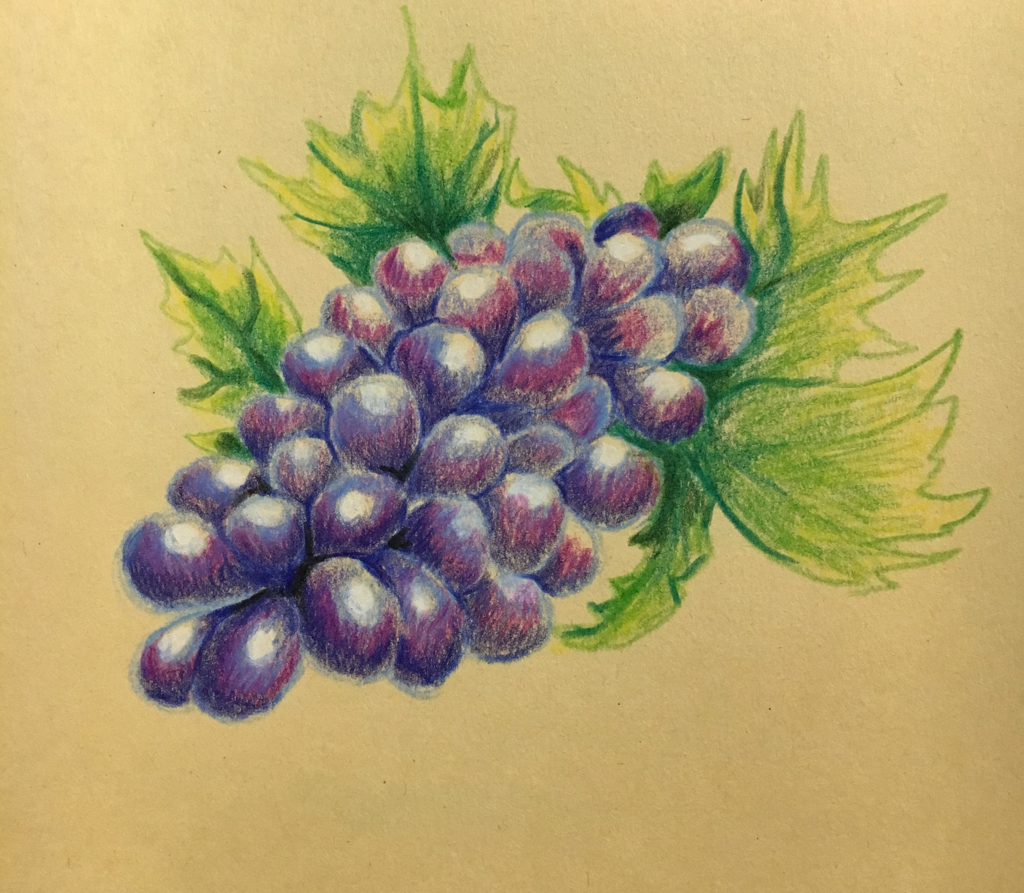
I used the same technique here and applied darks closer to the stem to give the allusion they were more 3D, along with the white highlights I applied in circular motions.
Glass
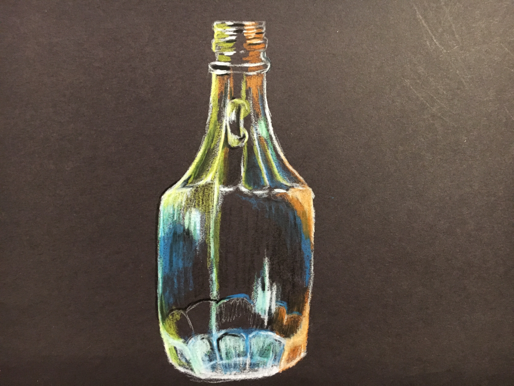
we drew the highlights in white prisma and added the color to the glass corresponding to the background and the way the glass reflected it. I tried to show depth.
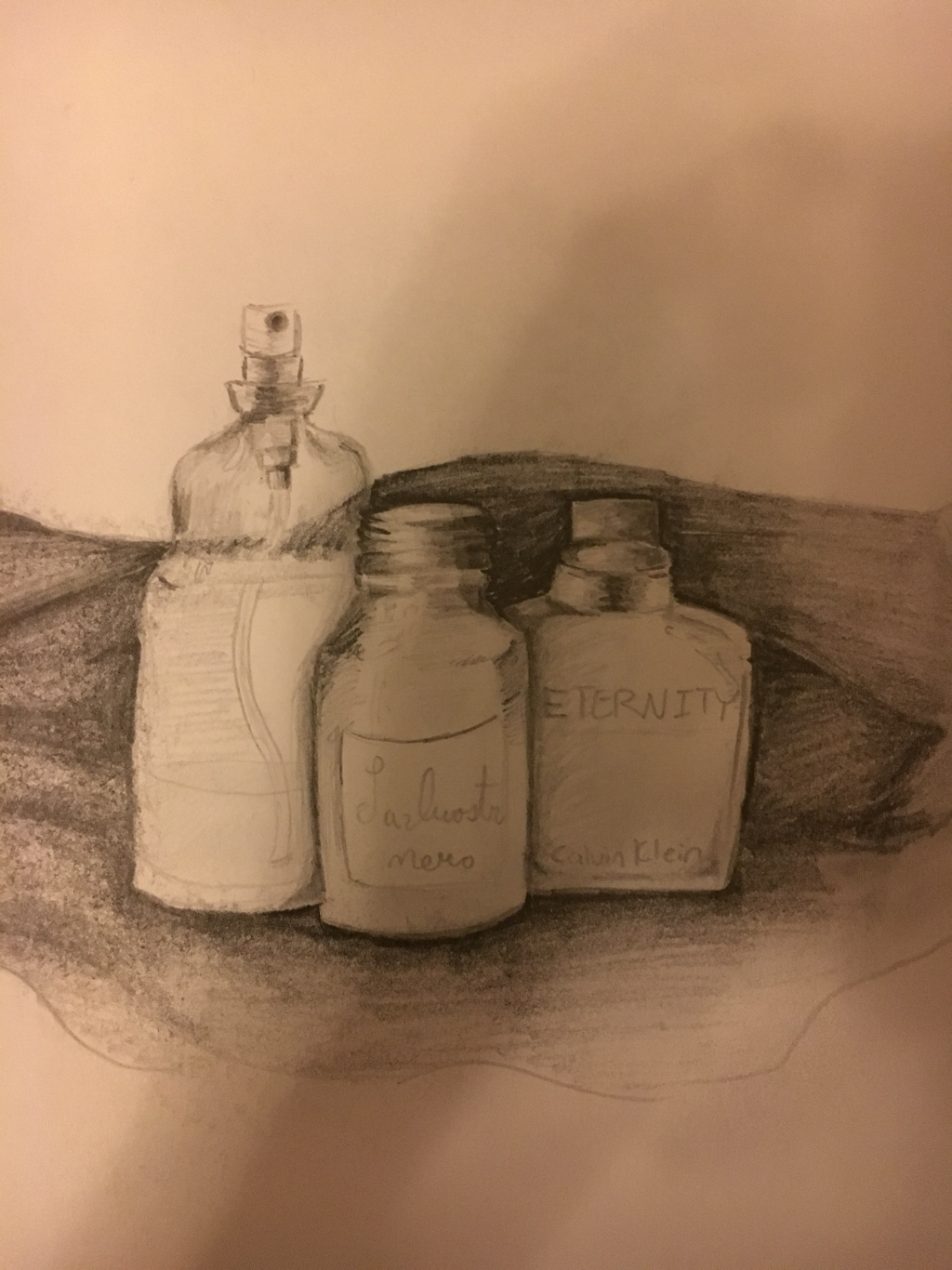
Homework
Here i took two different textures and added value with graphite to create contrast between them.
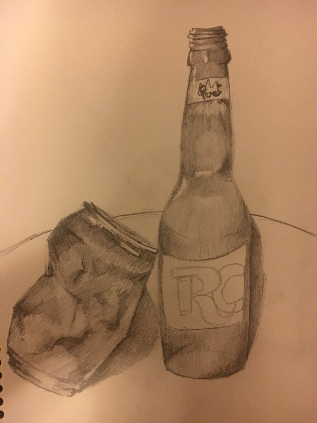
Homework
I used value to draw this 3 figure still life which were all glass bottles.
Homework
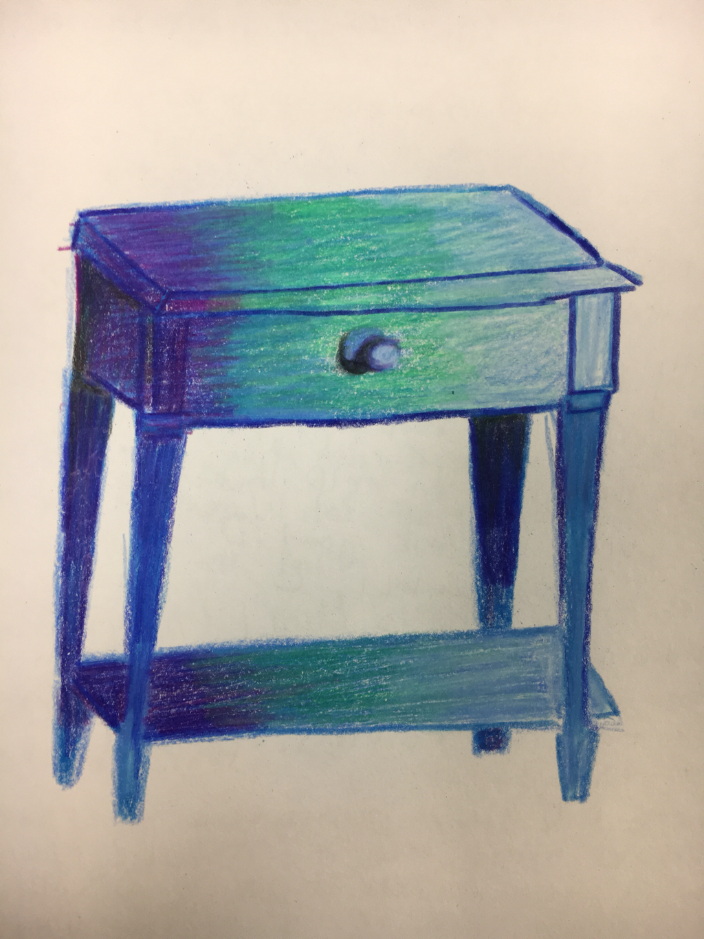
I drew a piece of furniture and used color to add value.
Reference pictures foreshortening
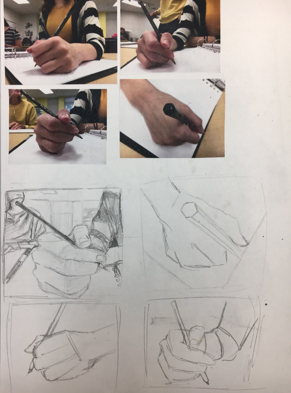
I already chose the composition I wanted and was running low on time for choosing anyways.
Foreshortening pre images
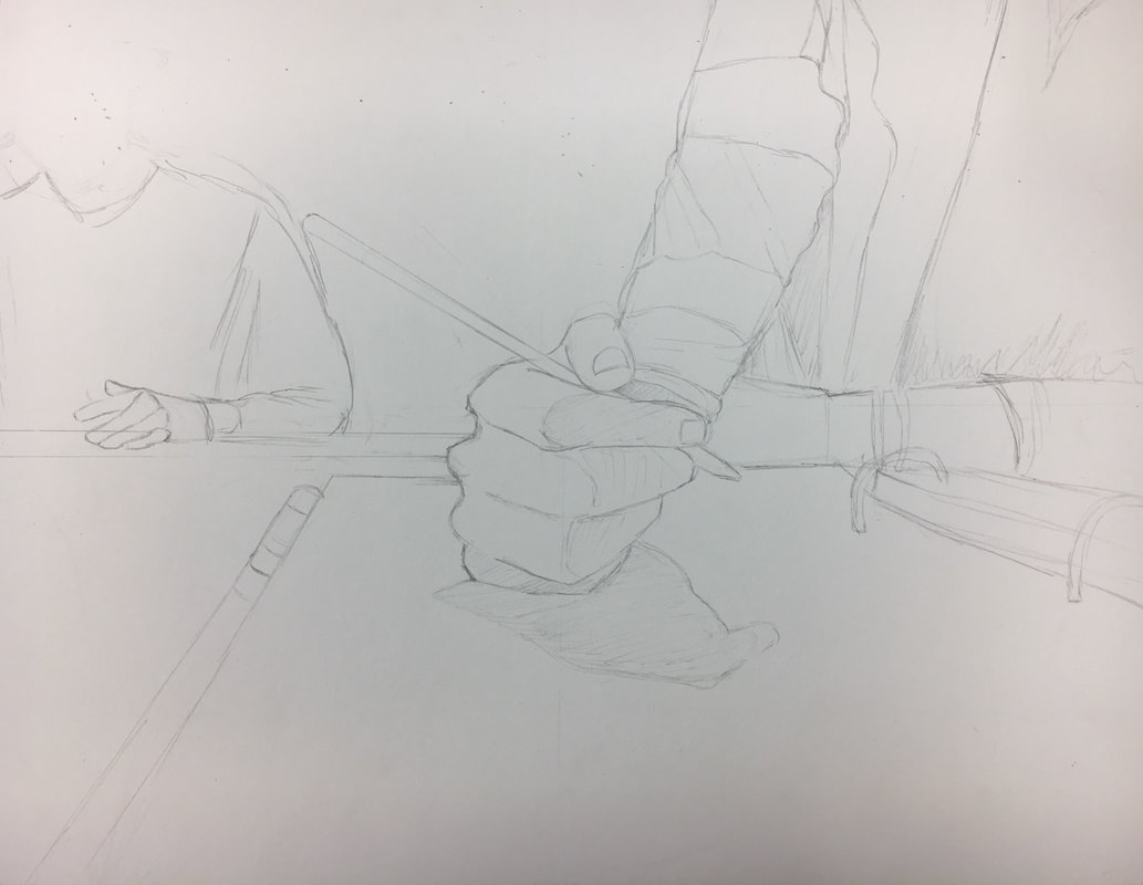
I took my reference pictures from my sketchbook and created a composition I was pleased with. Just a simple outline.
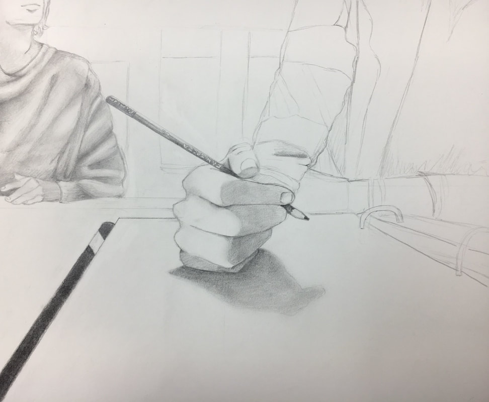
I started shading the hand and pencil since it’s really the center of the piece, I also worked on the fabric on Ben’s sweater in the back.
I continued adding in value for the fabrics and darkening values over layers I already placed down to add depth and add to my perspective in bringing the hand forward.
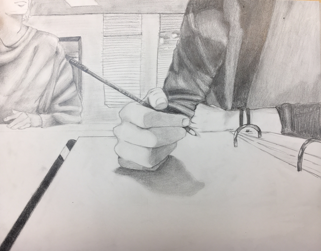
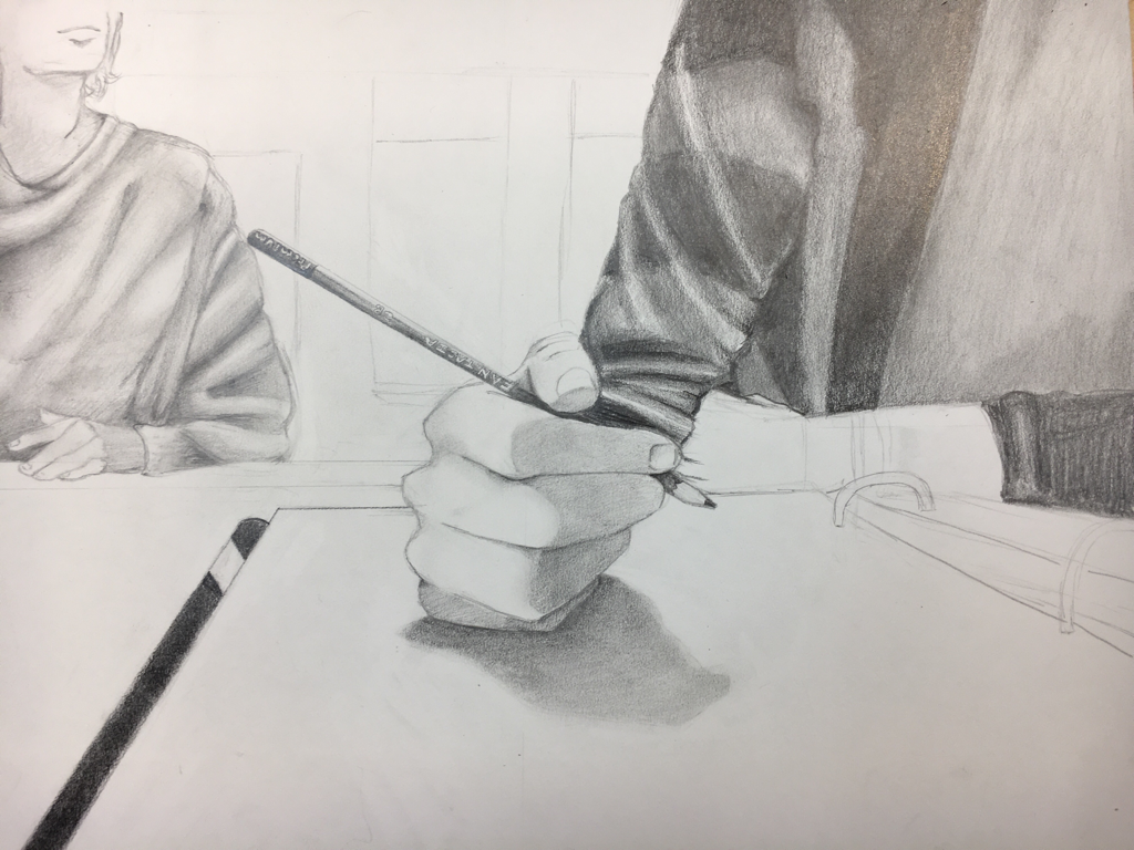
1. Describe how you created an interesting point of view? Was it successful? Why or why not?
•I made it so that you got a point of view of someone before they put down their ideas on a piece of paper, the hand is closer to the camera and the forearm is out of sight, this drawing is successful in giving the illusion that it’s coming forward and setting objects in the background.
2. Why is it important to understand perspective and how to draw it?
•It’s important to understand it because if you don’t the proportions are out of place and perspective has to be very accurate to look realistic.
3. How were the colored pencil exercises important in the success of your piece?
•In this piece I used graphite, but the colored pencils helped me see what shades of black and white the colors in my reference pictures could be. Ex: the yellow being a lighter shaded area, the black being a harder pressure on the pencil.
4. Describe the craftsmanship of your colored pencil. What techniques were used? (How well the project is technically crafted).
•I used a paper towel for smoother shading and angled my wrist to cover larger areas with the pencil. This was made with rulers and shaded carefully and drawn with accuracy. The proportions on the figure in the back could be better sized/accurate.
5. Were you able to achieve depth by showing a foreground, middle ground and back- ground? Explain.
It gave my figures more realism by setting aside the background, from the table closer to the camera. Before it looked all like it was floating on the same plane but different sizes but the added environment around it gave it distance and a sense of perspective.
6. Explain your experience with colored pencil and the project in general. What were the obstacles and advantages?
•The lessons in fabric we did really gave me some leeway in drawing the figure’s clothing and giving the room a light source. The obstacles were the proportions and finding the light source. The advantage was the project we’ve done before with the still life. Gave me a head start on perspective before this project.
7. Looking back on the progression of this project what skills, techniques or other information would you like to have been taught? Do you feel you were prepared for this project?
•I do feel I was prepared for this project but that doesn’t mean I don’t think each time that I could’ve done a lot better. I don’t know what else to have been taught in this project. Maybe how to get more detail in the background in the glass and window blinds.
Chalk Candy
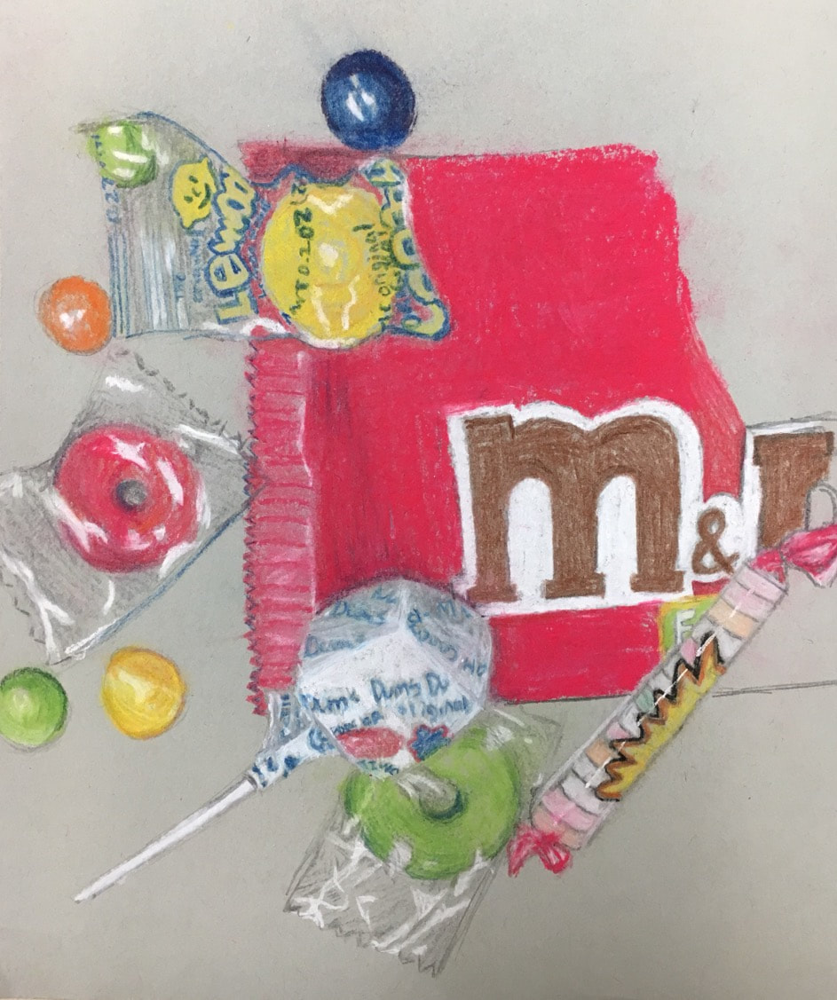
This looks better if you squint your eyes and take 10 steps back. This was an opacity practice with candy wrappers where I learned to add in the highlights and toy around with techniques to make them more realistic than it would look without the practice.
In progress opacity
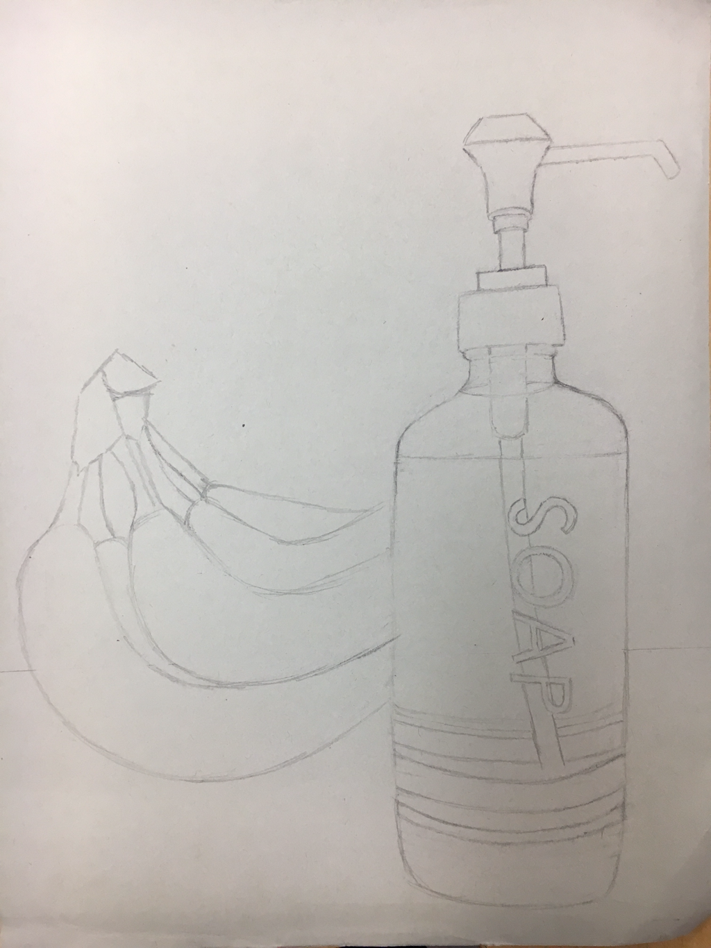
Here I laid down the outline and composition of the image I chose for my final project.
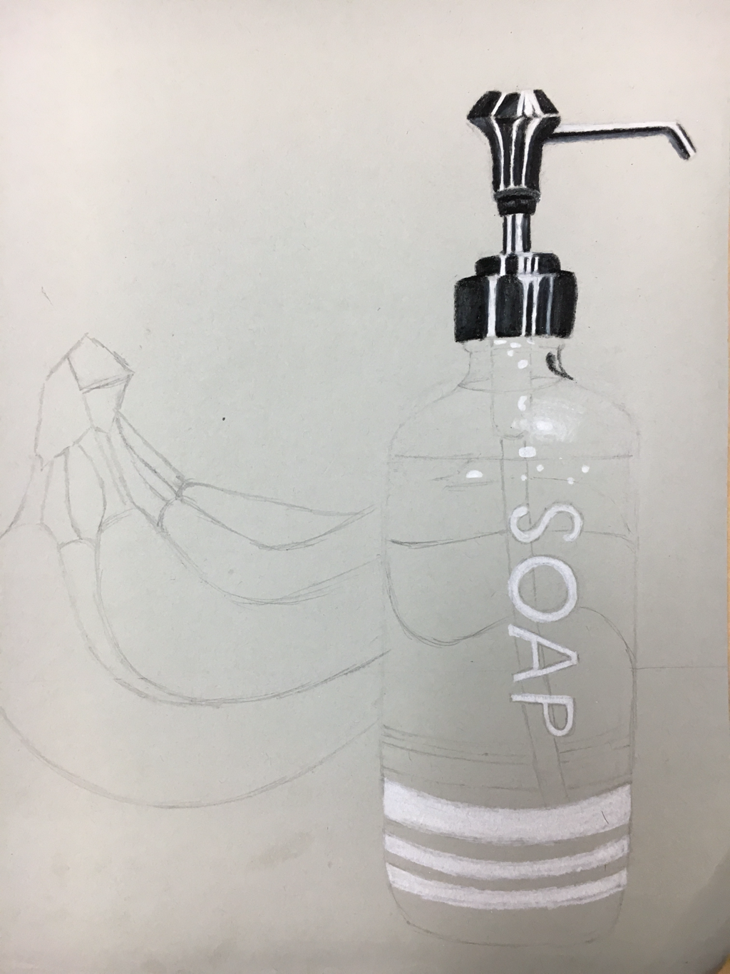
I started adding the whites in the picture that stood out the most and appeared in front and were the brightest
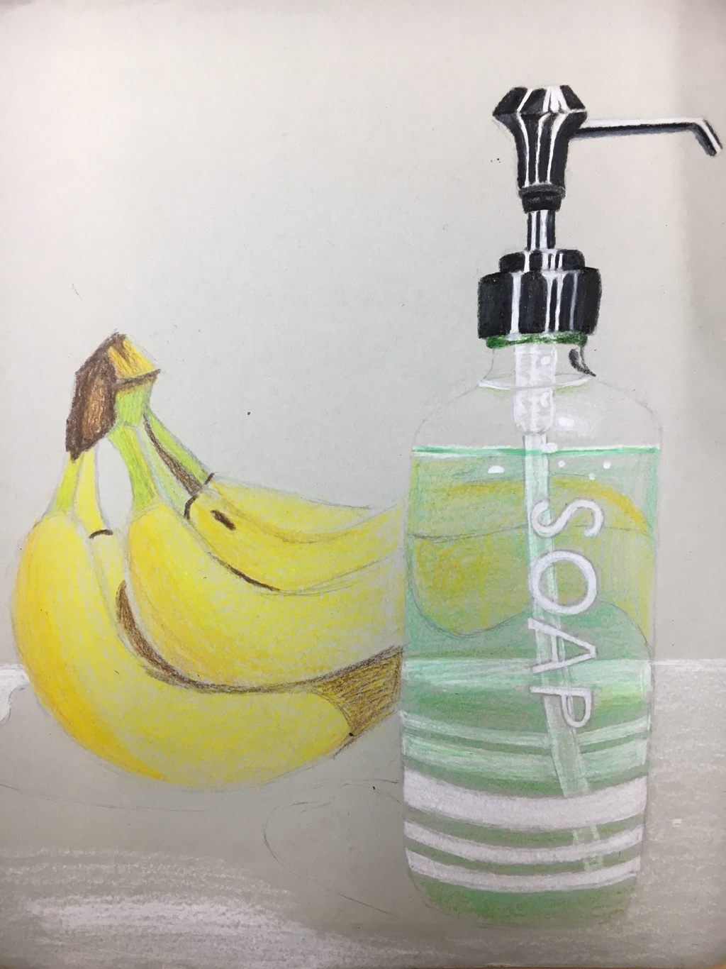
I finally started on color and laying them down to determine areas of shading and setting the whites in the bottle farther behind the whites in the front by dimming them down with the liquid in the bottle, and adding the reflection of the bananas in the bottle.
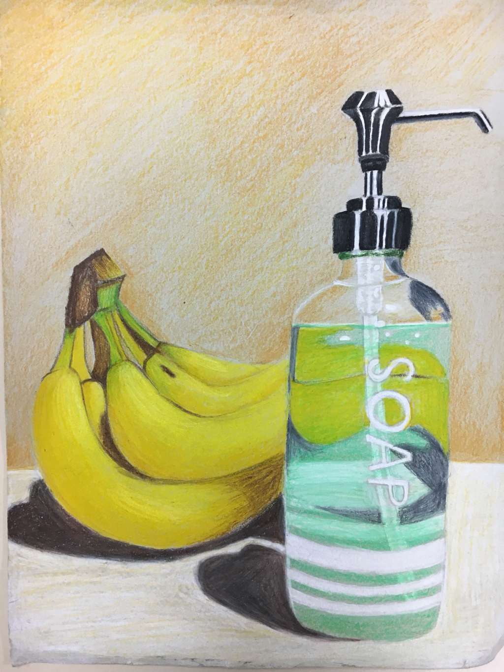
This is the final product.
1. Describe the craftsmanship of your drawing. (Is it neat and well executed?)
•I was very careful with my linework but it went a little off the rail on the counter top and the back wall. The majority of this piece is well executed.
2. Describe how your background choices help unify the three artworks and tie them together as one piece of art.
•Uh. The wall gives them an environment to be in? On a counter top..in a kitchen. With walls. Gives a sense of space and helps them look like they aren’t floating.
3. Describe your choice of colors/color harmonies and how you used them throughout the artwork.
•I always thought blue and green and yellow complimented each other a lot and it’s what caught my eye when I was trying to find something that would look nice with the soap bottle. They aren’t relative in what they are but they have nice colors.
4. How did you create contrast in your drawing?
•The highlights and dark shadows being right next to each other, and the darker brown between the bananas to separate them.
5. How did you use textures, highlights and shadows to enhance your artwork?
The highlights and shadows gave the objects depth and texture. The metal was really reflective and the plastic/glass only absorbed light in certain spots so it showed differently.
6. Why did you choose a particular background color to mount your artwork?
•this question seems targeted, I used the color closest to the wall in my reference picture.
7. Discuss the importance of understanding the media (prisma or pastels) and acquiring the skills necessary to create a successful project.
•It’s application and layering. In order for it to look good it needs to be layered with multiple colors because not everything has one underlying color, to give it a realistic look it needs layers and texture. A skill that comes with this project is patience.
8. Describe any difficulties you had creating your drawing and what you could do to improve your drawing?
•Had trouble making the soap look transparent and getting smooth shading. I would take more time on the backround and trying to get the lettering on the bottle more accurate. I also had trouble making the bottle look straight and like it was hollow.
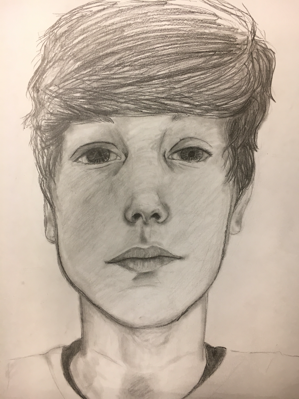
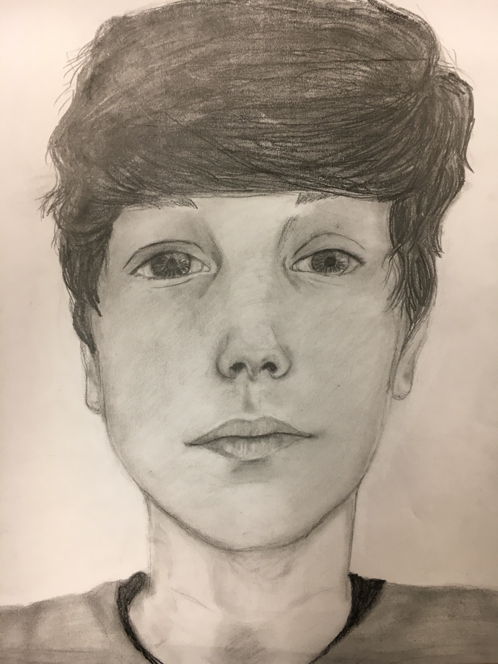
Skull face proportions
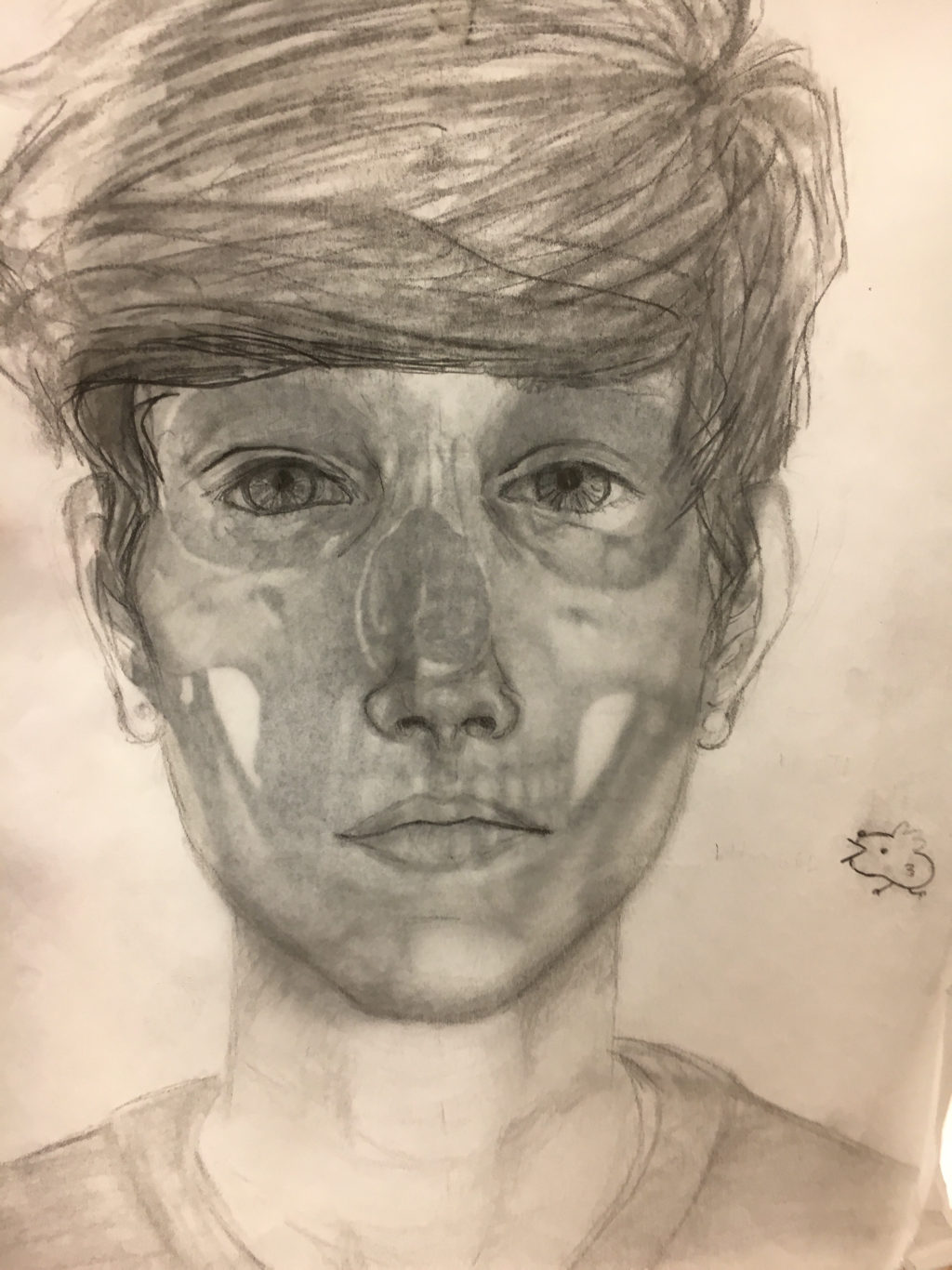
Here we practiced our knowledge of facial proportions over a general shaped skull to give us a better understanding of the bone placement and where the features should lie on the face.
Lips and noses
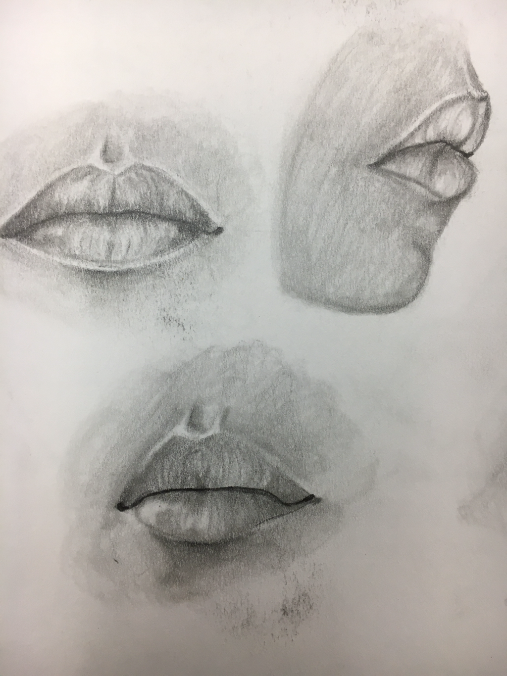
Here we learned how to draw lips based on video tutorials and some constructive guidelines. We focused on shading with the shape and really going in with those values to make it look 3-dimensional.
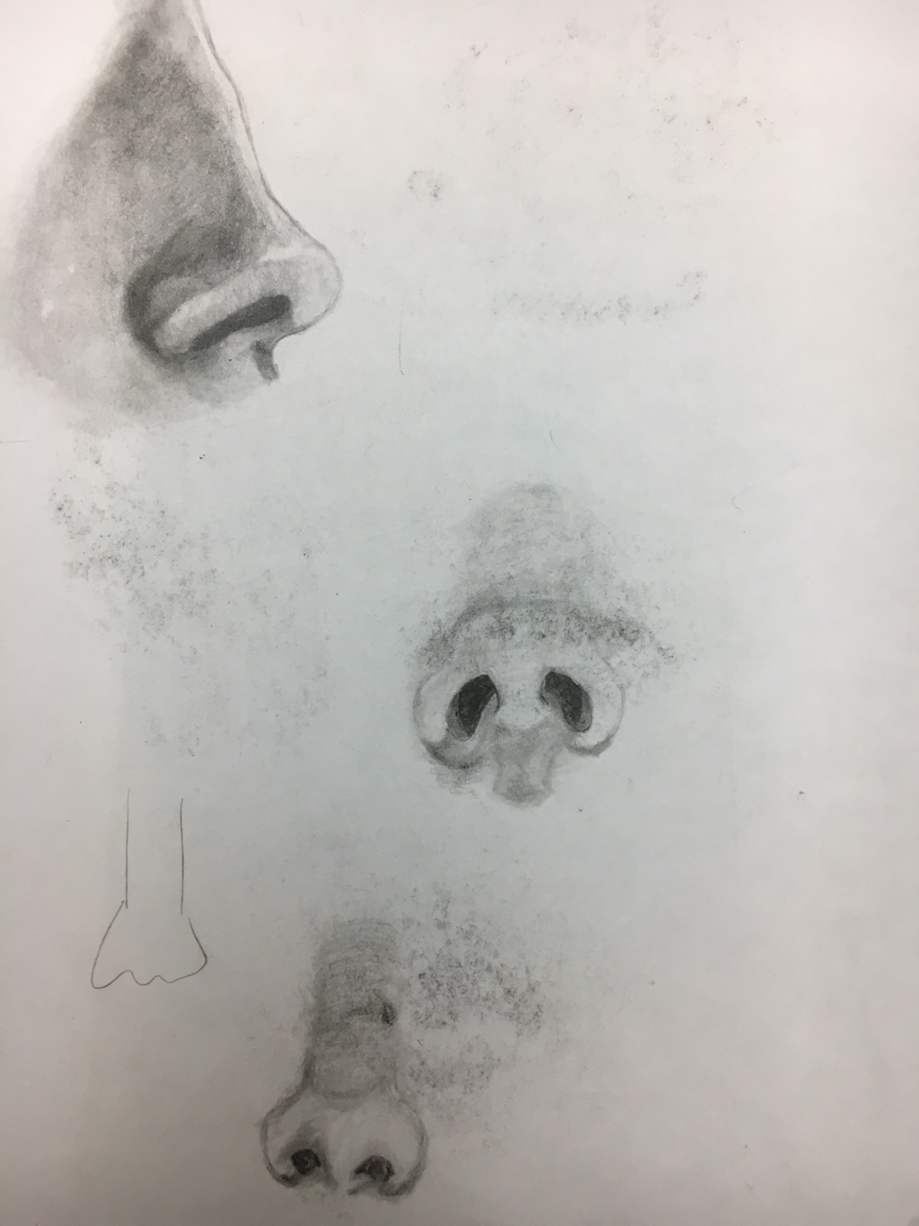
same thing goes for the nose. These are my practice, some of the graphite rubbed off so it’s not as nice as it was when it was untouched and freshly drawn.
In Progress
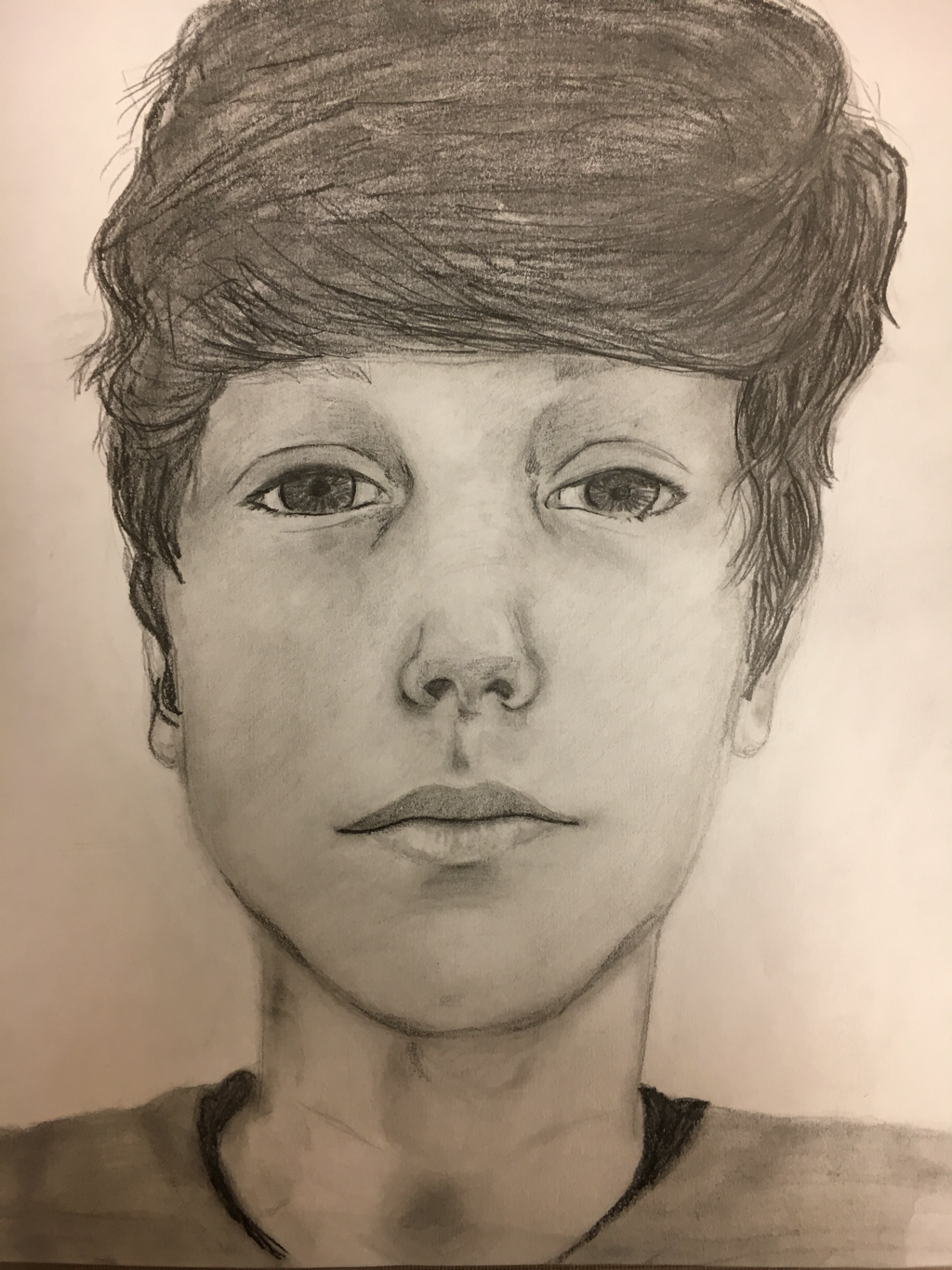
Final
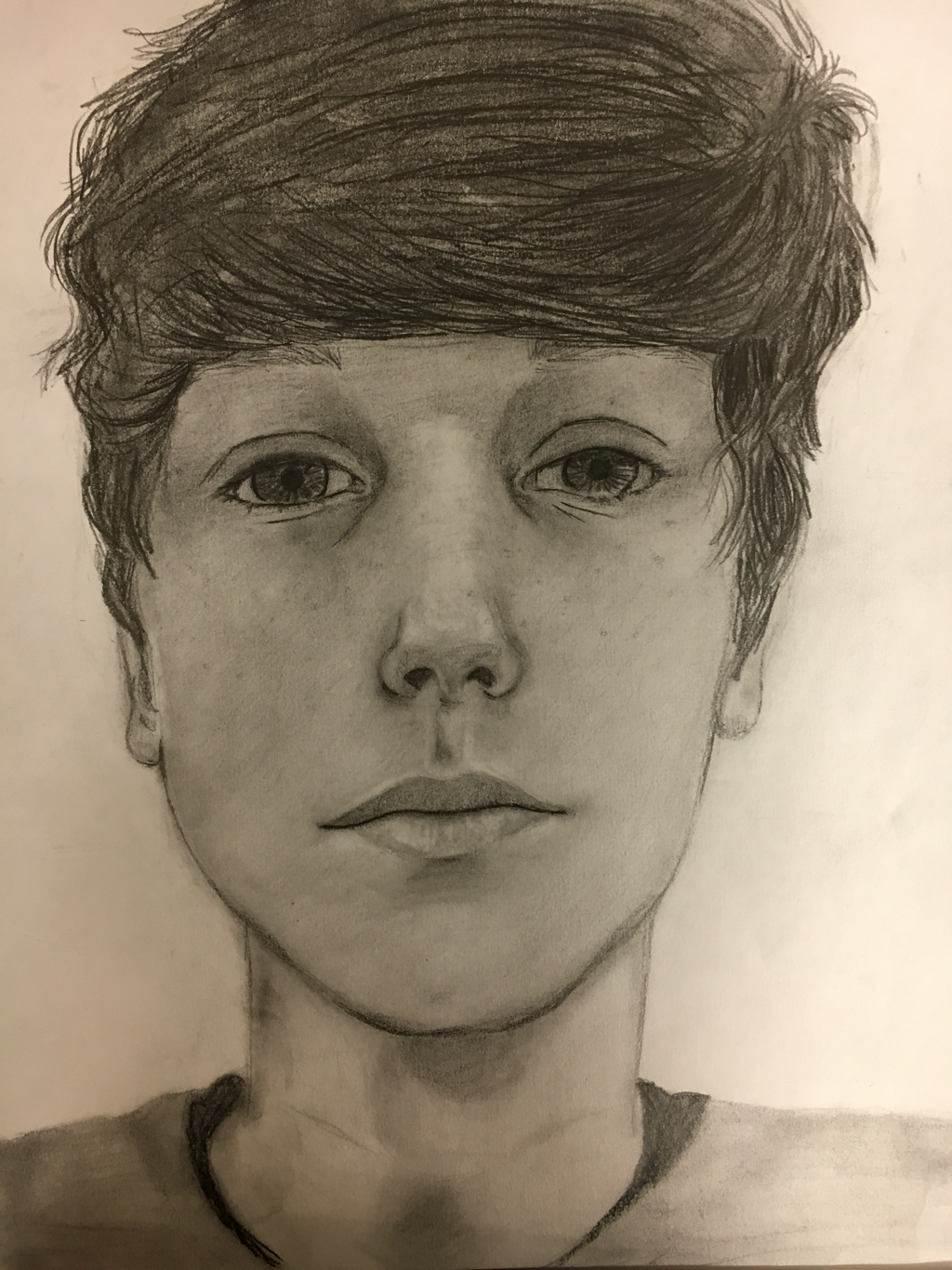
1. Explain the process you went through to develop your drawing.
•Well I started with my basic knowledge of facial proportions and did the outline of my face shape and features to get an idea of the shape and size of those features. Then I started shading in where it needed value.
2. Explain how you found the different values in the portrait?
•I looked at the higher areas on my face and made those lighter, while the deeper more sunken features were shaded in darker. I made sure to add the highlights and darken the shading along the way.
3. Did you achieve a full range of the different values within your portrait? How?
•yes. I have the dark darks, the mid tones, and the bright highlights to make sure the portrait looks like it pops out of the paper.
4. Describe your craftsmanship. Is the artwork executed and crafted neatly?
•Yes the lines and shadinf were carefully
5. How were you able to capture your look?
•I looked at a basic generic face and put my features where those features were by measuring using the eye technique.
6. Explain how you made sure you had correct facial feature placement.
•I used The eye Technique. What we learned. The facial proportions. I modified them to look like mine by using a reference picture.
7. Explain the importance of learning how to draw all the features individually.
•If you don’t draw your features correctly. It won’t look like you. If you don’t know how to make them realistic. Your drawing won’t look realistic. And it won’t look like you. Because you are not a cartoon. You have facial structure and texture effected by light and shadow. Learning each indivial facial feature brings realism to your piece.
8. What part of this unit was the most beneficial and why?
•The measuring of facial proportions. otherwise the eyes would be too high up and the lips would be too low. I feel like the measurements and the value tie hand in hand to making it successful. They’re equally important.
9. List any obstacles you had to overcome and how you dealt with them.
•making it look like me. I just looked at a picture. I didn’t know where to put all my features. So I used the 5-eye technique. I felt the face was a little flat. So I added value.
Scratchboard
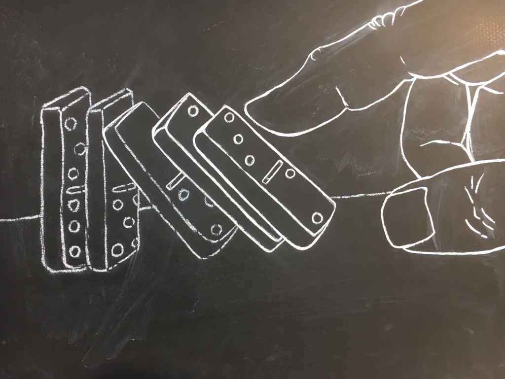
Basic outline I scratched into the board with an exacto knife.
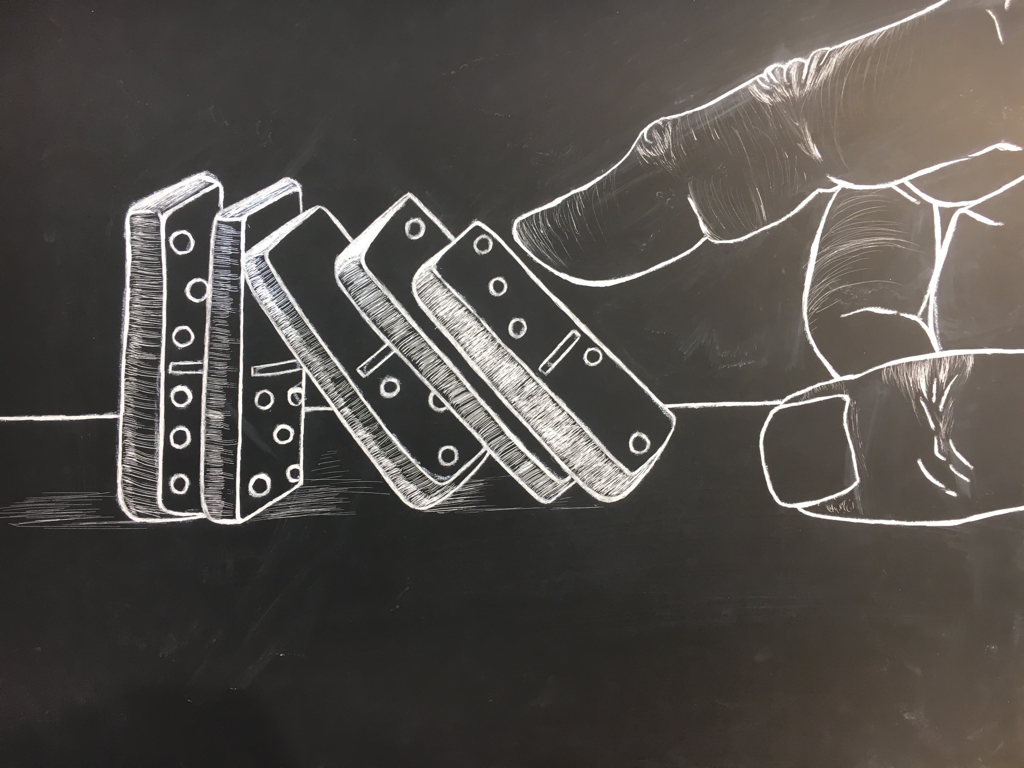
started adding in shading and value
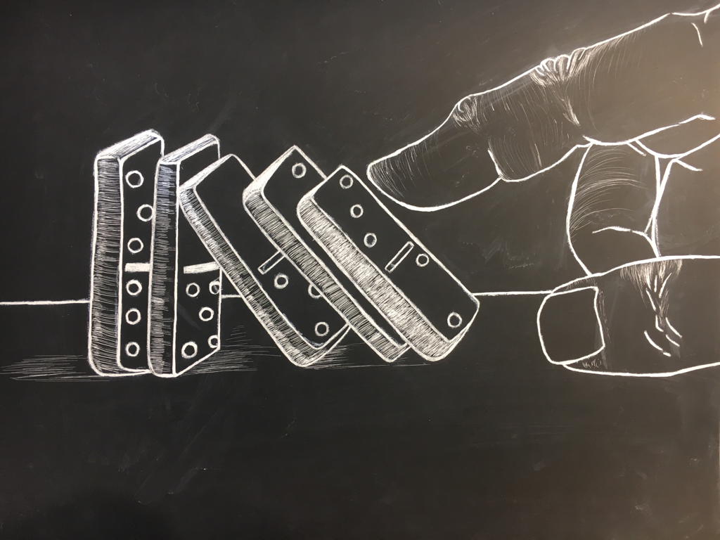
here I started finishing up the dominos
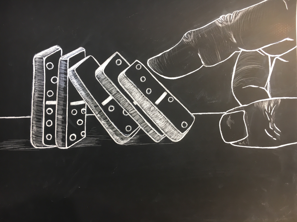
This is the final piece ^
1. Describe the subject matter and meaning of your artwork.
I chose to draw dominos. I chose it cause it’s a good way of showing movement and it could be symbolic or just open to interpretation. I don’t have a meaning behind it cause I read it in a lot of different ways.
2. How did you use textures to enhance your picture?
I used the wrinkles in the skin and the shading to show the reflectivity of object. I could’ve gone in and done something more with the skin texture.
3. How did you balance your artwork and create a well-organized composition?
I chose something simple and aesthetically pleasing. I put the finger pushing down the first domino more near the middle of the page where your eye is drawn to.
4. How did you imply movement in your drawing?
It gives you a sense of waiting for the other dominos to fall, because it’s inevitable that they will fall, it just hasn’t shown it yet. It’s like a video on pause. You know the objects are moving by how the hand flicked the first domino which led to a chain reaction to the rest of the dominos.
5. How could you improve your artwork?
Cleaner linework and more experience with scratchboard. More shading on the hand and more consistent line work.
6. How did you demonstrate a wide range of shading values?
On the folds in the skin on the hand, I didn’t know how to show the light source on the table. It seemed to be darker closer to the dominoes and I showed the table got lighter as it got farther away.
Reflection
In this class I definitely felt I was being taught to learn technical skills and how to be creative at the same time. I drew things I wouldn’t have drawn on my own time and now I bring a sketchbook around drawing things I don’t wanna draw cause it helps draw things I do wanna draw. If I needed help getting a better understanding of a drawing technique that wouldn’t be a problem, it’s always explained clearly and in a way it’s easy to remember the steps. I enjoyed seeing other people’s work because i picked up a few things from what I saw and I apply it to drawings and ideas I have. It’s very important you look at other people’s art it helps them get a constructive review on how to improve their work and your own. 10/10 would recommend this class to someone that wanted to learn how to draw creatively and how to develop discipline and practice. Although at times I felt pressured to think up an idea quick to draw and led to me not being excited to create it cause all I’d focus on was the due date. I think more than a day’s advance for brewing up ideas and compositional sketches would help. Overall a good experience and I regret raising my hand to try to get out of it last year. I needed these classes whether I wanted to admit it or not back then.
