Not Trite
I made an idea map where I would link certain thoughts and images to my chosen word "passion". The whole piece was about the fear of losing my passion for art because of everything in life that could interfere with that drive to keep doing what you love.
Texture prisma challenge
Here I was challenged to for one, use prisma correctly until burnishing, and two, to use techniques with those prismas in order to make an accurate representation of that texture. It was hard layering because I wasn't sure how many colors I should have been layering and was kinda scared to go outside my shell when it comes to colors. I learned to lay down your light colors first and not to press your pencil too hard on the first few layers.
Ten minute challenge
We are given a ten minute challenge to draw what comes to mind when we are given a word. It's challenging because you're trying to portray the word with a visual in a limited amount of time. My word was "lost". What I learned is quick thinking and that with mistakes come more lessons from those mistakes. This was done in prisma as well.
Final Prisma Project
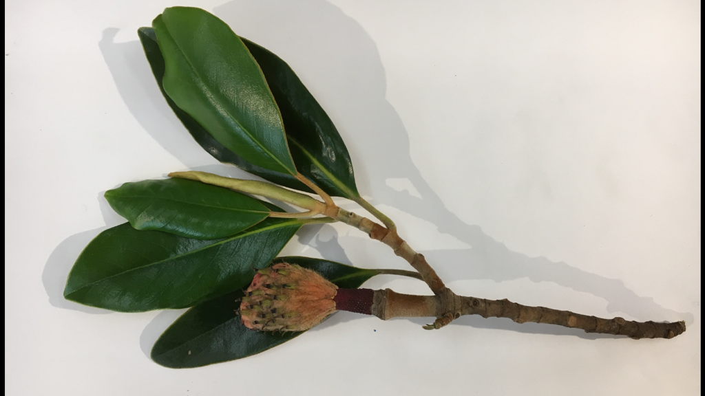
I chose to draw this magnolia plant. I had a bit of trouble fitting it on the page though.. lots of rough drafts
So I finally outlined part of the magnolia and added my colors and decided the paper I'd use and the composition and finally it came to this
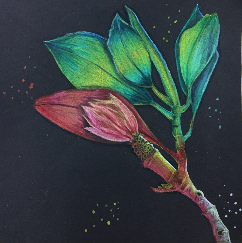
It was difficult knowing what colors to go with. I kind of winged the colors to be truthful. I was not going for a rainbow look because I believed that color theme to be too trite. Instead I decided to try and blend colors that would be difficult to blend. I feel the pink compliments the piece well. This project taught me to explore the color spectrum and put together colors I wouldn't normally put together. I didn't know much about prisma colors and I still don't. I feel like I can't explain what I learned because it takes you experiencing it yourself to "know" what you're doing if that makes sense. I used the darker colors and the shadows, some as the midtones and the whites to highlight it and add contrast. The black prisama is very pigmented so even against the black paper and my colors, it made it pop off the page even more. I'm glad I didn't completely layer the prisma, it looks good deeply pigmented in other places while others are more lightly layered. I also learned from my pencil shavings. The yellow pencil dusted off on the page and it looked pleasing, like sparkles almost. So I added small dots of color that looked good next to the color on the plant. It was also a good way of filling up the page more.
Figure Project
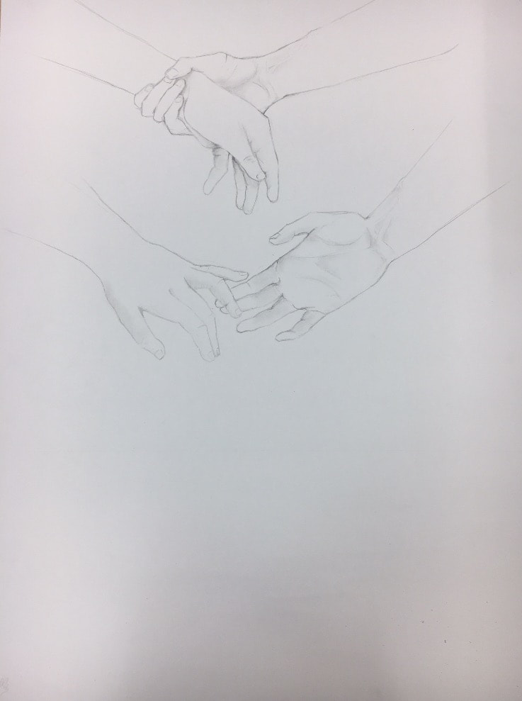
I had two lovely hand models let me take some reference pictures for this project. I chose to use the figures to show emotion, or a story.
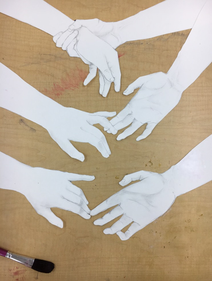
I drew the third set of hands and cut them all out to put on a gradient water color background so I didn't get too much paint on the hands.
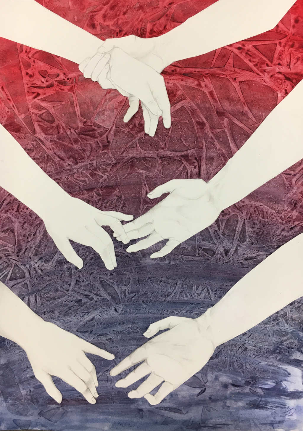
This is my final piece. For the background I set plastic on the wet water color and let it dry and peeled it off to give it a sort of geometric background. I used the colors to match the emotion implied by the hands. As a classmate said, the red shows warmth but as the gradient fades it grows cold. Poetic. What I learned about figurative work is it's one of my favorites. It's difficult to portray what you want to with imagery and no words. But what I've seen people do with it is both beautiful and amazing. I try to put something personal in my work to make it more genuine and thought out. I feel that adds to this piece. What I'm still wanting to learn is better anatomy but I'm teaching myself that. I still need to know how to not be afraid to exaggerate movements or emotion or shading. I need a push and shove sometimes to better my work. I credit all the people that gave me help and advice because I could not have put it together the way I have without em.
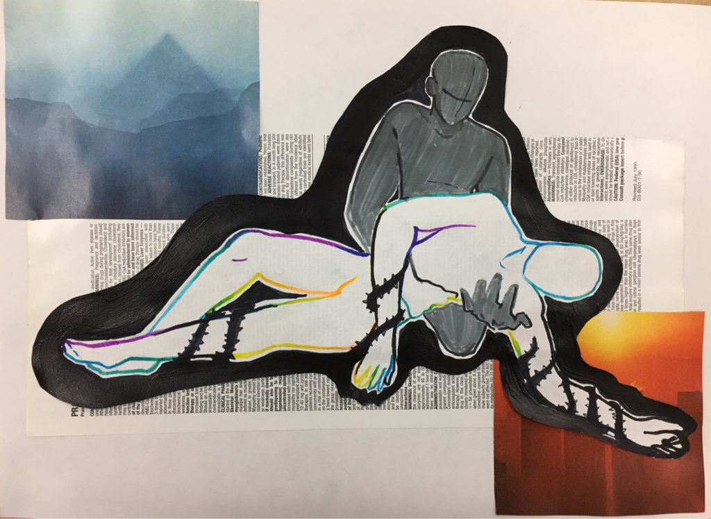
Oil painting surreal
Here I wanted to paint something that ties to loyalty or a general bond with the people and environments around you. I was inspired by Margrite (pretty sure that’s how you spell it) and his painting with the two kissing figures underneath a sheet of fabric. I decided to make a more futuristic kind of album cover looking piece. What I found difficult was blending the areas around the fabric. There were points where I messed up and smeared the paint and had to wait for it to dry to correct it or layer it to cover it up. The underpainting did offer inspiration and made it easier to distinguish where a line should end or where I should fill in and what would look best as the backround. I like how the texture of the fabric isn’t flat and the compiled oil paint has a feel off of the page.
I have not oil painted much before so jumping into this was a little frustrating and sometimes stressful. But I’m glad I did it and now I can say I did.
I have not oil painted much before so jumping into this was a little frustrating and sometimes stressful. But I’m glad I did it and now I can say I did.
Scholastic Art Awards
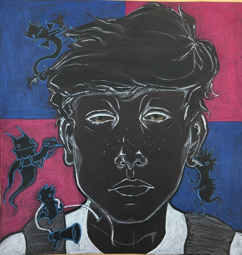
I made this to show different forms of emotional/mental distress. It’s open for interpretation and I felt doing a self portrait would should techiqual skill. I don’t know why I made it honestly it’s just been on my mind to draw something about mental health. Was struggling with it when I made it.
Personal Symbol
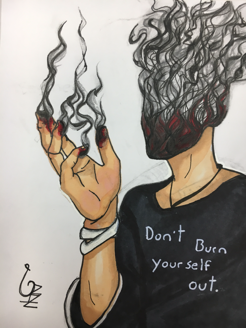
Ive been feeling overwhelmed lately. I’m overwhelmed in general, and I’m constantly trying to fix my problems by doing things that tire me or burn me out just so I feel accomplished or better about the time I used throughout the day. The hand and face are a symbol of the feeling you get when you run out of fuel and “shut down” or “burn out”. This is an Allegory to not overworking yourself mentally or physically.
